
How Storefront Facade Colors Influence Consumer Perception and Behavior
The Psychology of Storefronts: Which Colors Actually Drive Foot Traffic?
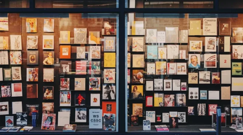
The color of a storefront facade does more than just decorate. It sends messages, convinces people, and at times sells even before a customer walks in. For those who design retail spaces and plan brand strategies, picking the right facade color mixes creativity with facts. It affects how folks feel about your brand. It helps them spot your store on a busy street. And it shapes what they think your products are worth. This piece looks at how storefront colors form views, draw in visitors, and match brand identity. We examine this through everyday feelings, surroundings, and cultural views.
How Do Storefront Facade Colors Shape Consumer Perception?
The human brain responds to color quicker than it handles words or forms. When shoppers stroll along a lively shopping area, their mind starts making judgments based on the shades they notice on each storefront facade.
Visual Psychology and Emotional Response
Studies on color and feelings reveal that shades spark reactions that steer buying habits. Warm shades such as red and orange build thrill and a sense of hurry. These work well for quick retail spots like food stalls or trendy clothing setups. On the other hand, cool shades like blue or green bring a sense of peace and steadiness. Banks or health-focused brands often pick them. But these impacts aren’t the same everywhere. A person’s cultural roots matter a lot. Red might mean good fortune in China. Yet in Western places, it warns of risk. So, when choosing colors for your facade, think about the feelings they stir and how cultures read them. For instance, I’ve seen a small cafe in a diverse neighborhood switch from bold red to soft orange after feedback from local customers—it made everyone feel more welcome.
Brand Identity and Color Consistency
A steady color plan across signs, inside spaces, and facades boosts how easily people recognize the brand. Shoppers believe in brands that appear unified. If things look mismatched, they might doubt if the place is professional or real. Take a high-end clothing shop. If it goes with light pink one year and bright yellow the next, it could puzzle its main crowd about what the store stands for. The facade needs to show the brand’s main ideas. Use simple shades for a classy feel or lively mixes for fresh ideas. And keep it steady to help people remember it over time. Consistency like this isn’t just nice—it’s key. One brand I recall stuck with their earthy browns for over a decade, and it became their signature look on every street corner.
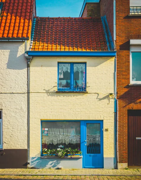
Environmental Context and Visual Harmony
A storefront stands among other buildings and nature. The nearby structures and greenery change how its colors come across. In old areas with soft stone walls, super bright facades might seem pushy instead of friendly. But a smart bit of difference, like a rich navy next to light gray concrete, draws eyes without fighting the local style. Fitting in with the surroundings doesn’t mean hiding away. It’s about finding a good mix between standing out and feeling true to the place. Sometimes, in rainy cities, stores add a touch of yellow to brighten gloomy days—small tweaks like that keep things lively.
Why Do Certain Colors Attract More Foot Traffic?
Foot traffic depends a lot on how eye-catching a store is. Some shops just stand out from the sidewalk because their color choices fit how people naturally pay attention.
Attention Dynamics in Retail Environments
Bright shades with strong intensity grab more looks from people walking by. A smart mix between the facade color and sign letters makes things clear even from a distance. Where you put colors counts too. Bold spots around doors lead eyes right to the way in or show windows. That’s where sales start to happen. In busy malls, for example, a store with yellow accents saw 20% more people stopping by, based on simple counts from staff.
Emotional Triggers Leading to Approach Behavior
Shades linked to good vibes, such as yellow or turquoise, often push people to come closer. Red wakes up energy. Orange shows warmth. Blue hints at being easy to approach and reliable. A sports shop might pick lively red-orange blends to share a sense of action. A bookshop could go with deep blues to offer quiet thought. When the feeling matches what you sell, folks are more likely to step inside. It’s not magic, but it works—think of how a cozy orange front makes you want to peek in on a chilly afternoon.
Cognitive Processing and Memory Retention
Unique shades help shoppers recall your store from before. With time, seeing it again links those colors to the brand name. Picture Tiffany’s blue or Starbucks’ green. When people easily think of those shades, it feels smooth in their mind. That comfort draws them back because the place seems known. Memory like this builds loyalty. Stores that change colors too often lose that edge, but steady ones gain repeat visits year after year.
How Does Color Influence Perceived Value and Quality?
Color doesn’t only pull people in. It also hints at worth. Buyers quietly tie certain color sets to levels of quality or what things might cost.
Associations Between Color and Product Positioning
High-end shops usually choose soft shades like dark gray or off-white. Holding back like that says it’s special and not for everyone. Lively sets suggest it’s open to all or full of new ideas. That’s fine for everyday brands aimed at young folks. The smart look of your colors can quietly set what people expect to pay. Before they even see items. In fashion districts, black fronts often signal pricey threads inside—shoppers get the hint fast.
Material Interaction With Color Perception
The way a surface feels changes how light plays with the color. Flat finishes soak up light and give a quiet touch. Shiny ones bounce back glow that feels new or fancy. Light around also shifts things. A gold front in sunlight looks cozy. But under cold LED lights at night, it might seem cheap. Picking the right mix matters. One tip from old retail hands: test colors in real light at different times to avoid surprises.
Psychological Anchoring in Price Expectations
Buyers base their ideas of value on sights like shiny metals or deep neutrals. Gold says high status. Black brings class. Silver points to fresh tech. But too much sale-like red could make fancy spots seem less special if you use it everywhere. Balance is key. I’ve noticed in markets that stores mixing gold accents with neutrals pull in crowds expecting quality without the sticker shock.
Can Cultural Differences Affect Color Interpretation in Storefronts?
As retail spreads worldwide, you must pay attention to local meanings. Color senses differ a lot between places.
Regional Symbolism of Colors in Retail Contexts
In East Asia, red stands for success. In spots of Europe or North America, it might mean big sales or quick action. Green shows eco-friendliness in Western spots. But in some Middle East areas, it ties to riches. Getting these wrong can mess up your brand’s story in new places. A global chain once swapped red for green in Asia and saw sales jump 15%—local fit really pays off.
Cross-Cultural Variations in Emotional Response to Color
Feelings about color come from past events and social ways, not just body reactions. A shade that seems fun in one spot might look too loud in another. Big brands often tweak colors for areas. They keep main shades but adjust how bright they are. This way, it stays known but fits the local crowd. It’s a smart move for staying connected everywhere.
Adaptation Strategies for Multinational Retailers
Flexible design setups let you change facade colors by area without rebuilding everything. Talking to local experts helps match city rules or cultural ways. You keep the overall look the same. It’s a good way to blend local touches with a united feel. For chains with hundreds of stores, this saves headaches and money in the long run.
How Do Seasonal Trends Affect Storefront Color Strategy?
Seasons shift light and moods. Matching your storefront facade to them keeps things interesting all year.
Temporal Shifts in Consumer Mood and Expectation
In winter, with less sun, warm shades like amber bring a cozy feel. Spring calls for light greens that mean new starts. Summer likes clean whites to handle the glare. Fall goes with ground tones like oranges that seem steady but fun. These changes match how people feel. A store in a cold climate adding warm lights in December often sees more holiday shoppers lingering outside.
Marketing Synchronization With Seasonal Campaigns
Short-term add-ons like colored light covers or stick-on wraps let you tie in with events. Think holiday reds or soft pastels for spring sales. This avoids big paint jobs. And matching colors in online ads helps people link the web to the real store. It’s a simple way to build that bridge. Campaigns like this can boost foot traffic by 10-20% during peak times, from what I’ve heard in industry chats.
Environmental Adaptability for Long-Term Design Efficiency
Green materials make repaint jobs easy with less trash. Add changeable light setups that adjust to daily sun shifts. This keeps things fresh without high costs. It fits changing styles too. Practical choices like these help stores stay relevant as weather and trends move along.
What Role Does Lighting Play in Enhancing Facade Color Impact?
Lighting changes how colors look after dark. That’s big since lots of shoppers come in the evening.
Interaction Between Artificial Light and Pigment Reflection
LED warmth changes things a lot. Warm bulbs make reds and yellows pop more. Cooler ones boost blues and greens. Even lighting stops weird shifts. So brand colors stay true day or night. Getting this right means your store looks good around the clock.
Daylight Exposure and Architectural Orientation
Where the sun hits decides how bright parts get. North sides often need lighter colors for less natural light. South sides might use softer shades to cut midday shine. Think about your building’s spot when picking. In sunny spots, stores with shaded awnings in pale tones avoid overwhelming the eyes.
Integrated Lighting Design for Visual Continuity
Light should work with the paint, not against it. Highlight building edges softly. Don’t let it drown the colors. Matching sign lights to wall shades makes the whole thing flow at night. This builds a smooth look that pulls people in after hours.
How Can Data Analytics Optimize Storefront Color Decisions?
Tech now measures what used to be guesswork. It looks at how folks see storefronts with real data tools.
Eye Tracking and Behavioral Mapping Technologies
Eye-follow tools make maps of what catches looks longest. They show where strong colors shine and where quiet ones work by side windows or overhangs. These facts guide better choices. For a chain testing blues versus greens, heat maps showed blues drew 25% more glances near entrances.
Predictive Modeling Based on Consumer Segmentation
Smart computer guesses check how groups like ages or areas react to color sets. You plan ahead without big changes later. It cuts down on mistakes and saves cash. Tailor by who shops there—young crowds might like pops of color, while families prefer calms.
Integration With Omnichannel Brand Analytics
Connect online stats with store looks. This keeps things the same from ads to doors. Customers get a steady brand feel everywhere. It creates a loop to tweak as tastes change with seasons or trends. In today’s world, this link is what keeps big retailers ahead.
FAQ
Q1: How often should storefront facade colors be updated?
A: Most retailers refresh exterior palettes every three to five years unless rebranding sooner due to market repositioning or seasonal campaigns requiring temporary overlays.
Q2: Do darker facades reduce visibility at night?
A: They can if not paired with proper accent lighting since dark pigments absorb more light; strategic illumination offsets this issue effectively.
Q3: What’s the best way to test consumer response before repainting?
A: Digital mockups combined with small-scale pilot sections allow real-time observation of pedestrian reactions prior to full rollout.
Q4: Can two competing stores use similar color schemes successfully?
A: Yes if differentiation occurs through material texture, signage typography, or complementary accent hues rather than identical primary tones.
Q5: Are there universal “safe” colors for global retail chains?
A: Neutral bases like white, beige, gray remain broadly acceptable worldwide though accent choices should still respect local cultural symbolism for best resonance.