
Key Structural Elements in Classical and Modern Architecture
Buildings have long shown the spirit of their age. Think of the sturdy stone temples from old Greece. Or picture the tall, shiny glass buildings in today’s cities. Each time period’s designs highlight the tools, skills, and main goals of people back then. When you look at old-style and new-style buildings side by side, the differences run deeper than looks. They touch on how things are built, what they are for, and the big ideas behind them. This piece looks at how main building parts changed from old ways to fresh ideas. It pays close attention to how builders mix toughness, good looks, and real use.
What Defines the Structural Foundation of Classical Architecture?
Old-style building comes from even shapes, right sizes, and lasting strength. The base was not only about the ground. It was also about deep thoughts. Those thoughts came from math and the world around us. You spot this in places like the Parthenon. Or in big Roman halls. There, shapes ruled every pillar and curve.
Columns and Entablatures
Pillars did more than hold things up. They stood for neatness and rule. The Doric kind was plain and strong. Ionic ones had scrolls at the top. Corinthian types added leaves for flair. Each had its own sizes and pretty rules. The top part above them, called the entablature, spread out the heavy load. It included the architrave at the bottom, the frieze in the middle with carvings, and the cornice at the edge. These parts worked as a team. They made everything feel solid. That feeling shaped the holy places of Greece and Rome. I remember visiting a site once, and the way those pillars lined up just pulled you in, like they were whispering about ancient order.
Arches and Vaults
Roman builders shook up how things were made. They did this with arches and vaults. The half-round arch let them cover bigger areas. And they did it without thick walls everywhere. When they linked arches into long barrel vaults or crossed groin vaults, it opened up huge inside spaces. You see this in spots like the Baths of Caracalla. Or in the huge Colosseum arena. These shapes showed real skill in building. They also pointed to the big dreams of the empire. In fact, engineers back then figured out that one good arch could span 30 feet or more, way better than stacking stones alone.
Domes as Central Features
The dome turned into a big sign of connection. It linked the sky above to the ground below. The Pantheon’s dome is still one of the best examples from history. It forms a full round shape. That sits on a round base. An open hole at the top lets in light. This setup proved how shapes could blend exact building know-how with deep meaning. Rain falls through that oculus even now, reminding visitors of the weather’s role in daily Roman life. It’s a small touch, but it makes the space feel alive.
How Did Structural Innovation Shape Modern Architecture?
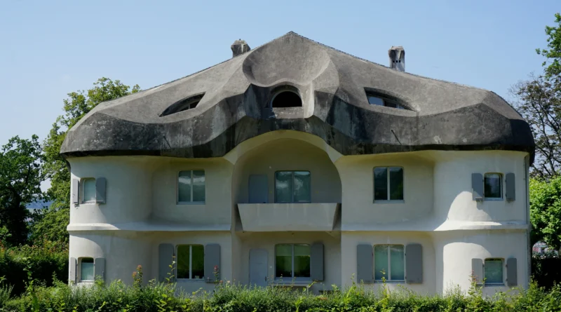
New-style building left behind fancy extras. It put the building frame right out front as the real beauty. Metal frames, strong concrete with metal inside, and clear glass opened up wild new options. Builders stopped covering up the supports with frills. Instead, they showed them off with pride. This shift happened fast in the early 1900s, when cities like New York started reaching for the sky.
Steel Frames
Metal changed the whole game. It let towers climb higher. And it used way less stuff than rock or bricks. The first tall buildings in Chicago had metal bones inside. Those bones took all the weight. So the outside walls could just hold glass. This was a huge turn from old stone ways. Workers could build floors up to 10 stories in months, not years, thanks to those frames.
Reinforced Concrete
Concrete mixed with metal bars gave bendy options that plain metal missed. By putting metal rods into wet concrete, builders made bends and overhangs that no one dreamed of before. Take Le Corbusier’s Villa Savoye. It shows how this mix created wide-open rooms. The flat roofs looked like they floated. They seemed so light. In places like that house in France, you walk in and feel the air move freely, no walls boxing you in.
Glass Curtain Walls
The curtain wall changed how open buildings could be. It used glass sheets hung on metal or concrete skeletons. Places like Mies van der Rohe’s Seagram Building made the front look like a glowing sheet. No longer did walls have to carry weight. Light turned into part of the build itself. On sunny days, those walls reflect the street below, pulling the outside world right into the rooms.
Why Is Proportion Still Central to Both Styles?
For all their gaps, old and new building both lean on right sizes to get things even. In old ways, it came from math counts. In new styles, it grew from what worked best. Both chase that sweet spot where a building feels just right, not too squat or too stretched.
Golden Ratio Applications
Builders long ago used the golden ratio. That’s about 1 to 1.618. It helped set sizes for fronts and room layouts. This number shows up in the wild, like in shells by the sea or on tree leaves. So buildings got a natural feel. That feel lasts through time. Even now, when I see a old temple, that ratio makes it look cozy, like it fits the hill it’s on.
Modular Systems in Modernism
New builders swapped old counts for grid setups. Those grids matched people sizes or factory rules. Le Corbusier’s “Modulor” turned body measures into a bendy guide for sizes. It kept things looking good without mess. This system helped crank out designs quick, like in post-war homes where every door fit just so.
Visual Balance Through Material Contrast
New makers often get even looks by mixing stuff. They pair heavy bits with light ones. Or solid parts with see-through ones. This nods to old ideas. But it uses fresh tricks, like tight metal ropes or hanging flat parts. In a building I once toured, the mix of concrete base and glass top made it feel grounded yet airy, almost like it could float if the wind picked up.
How Do Materials Influence Structural Expression?
What you build with sets not just how strong it is. It also shapes how it comes across. Old workers stuck mostly to rock. New ones try mixes and fake stuff, plus some old favorites. Choices like these tell a story about the era, from heavy loads in earthquakes to light breezes in hot summers.
Stone Masonry in Antiquity
Rock building stood for staying power. Each chunk pushed straight down on the one below. In some spots, they fit blocks tight with no glue at all. The feel of stone under your hand gave holy places a forever vibe. No other stuff matches that solid touch. Think of the pyramids; those stones have held for 4,500 years, shrugging off sandstorms.
Industrial Materials in Modernism
The factory boom brought ready-made metal bars and concrete sheets. They covered huge gaps and wild shapes. Plants turned into test spots for building tries. There, quick work met nice looks. By the 1920s, these materials let bridges stretch 1,000 feet, changing how rivers got crossed.
Sustainable Materials Today
Today’s new building thinks about green choices. It uses reused metal, glued wood layers called cross-laminated timber or CLT, and concrete with less harm to air. This mixes fresh building smarts with care for the earth. In projects like eco-offices, CLT panels go up fast and trap carbon, cutting build waste by half in some cases.
What Role Does Ornament Play Across Eras?
Extra touches show what people value. They also tie to hand skills passed down. Old extras were part of the build. New styles said “less is more” loud and clear. Yet, even in plain designs, a little flair sneaks in, like the curve of a handrail that just feels right.
Structural Ornamentation in Antiquity
Carved tops on pillars or side bands were not just for show. They pointed out where weight went. Plus, they told tales of gods or city pride cut right into the rock. These details made the whole thing sing, turning a simple hall into a storybook.
Functional Minimalism in Modernism
New makers cut out stuck-on extras. But they praised the build frame as the true pretty part. Bare beams, clear joins, true stuff took over from carved add-ons. Those old bits once showed off might or holy power. Now, the clean lines do the talking, quiet but strong.
Revivalist Blends in Postmodernism
After that, builders brought back extras in fun ways. They nodded to pillars or curves as signs, not real supports. This let old hints live with now skills. It skipped sappy looks for real work. In one quirky museum I read about, fake columns framed a glass entrance, blending laughs with solid build.
How Do Space and Light Define Architectural Experience?
Old open yards full of sun and new glass halls both guide how people move and see. They set the beat of rooms and glow. From quiet temple shadows to bright office floods, light shapes moods in ways words can’t touch.
Symmetrical Courtyards
Old plans often put yards in the middle. They lined up with north, south, east, west for fresh air and day glow control. This was smart green design way before folks named it that. In hot lands, those yards cooled rooms by 10 degrees, a trick still used in some homes today.
Open Floor Plans
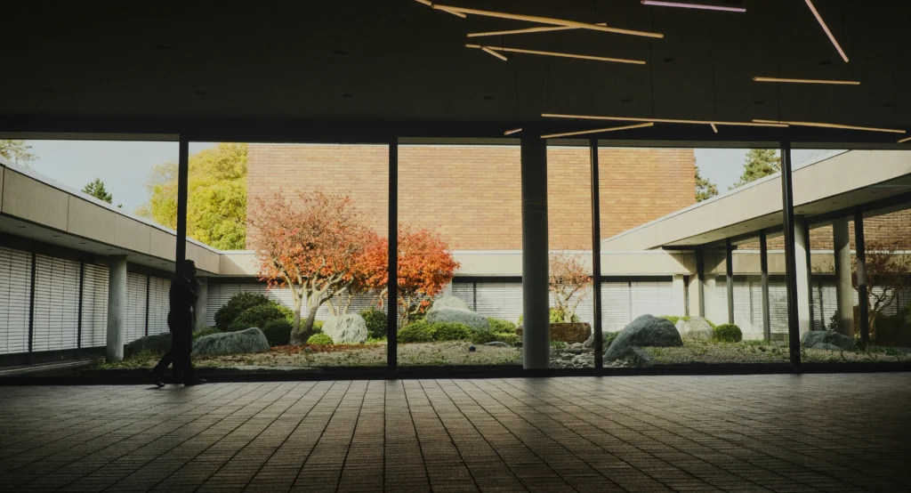
New builders broke down stiff room walls. They used strong centers to hold weight, not edge walls. So areas flowed under one big cover. Pillars stayed away from fronts. This let spaces blend smooth. Walking through such a spot feels like breathing easy, no corners trapping you.
Daylight Integration Through Glass
Glass fronts pull day light far inside. They link folks to city views. This flips old temple ways. There, light slipped in through tiny spots for big drama. Now, it’s all about welcome glow. But sometimes, too much sun means blinds go up quick, a real headache in tall towers.
FAQ
Q1: What distinguishes classical from modern architecture structurally?
A: Old builds use push-down systems like pillars and curves. New ones rely on pull systems such as metal frames. Those spread weight inside, not through thick walls.
Q2: Why did architects move away from ornamentation?
A: Better building skills made extras unneeded to show power. New makers liked showing plain stuff as the real beauty. They skipped carved bits for honest looks.
Q3: Are domes still relevant today?
A: Yes, but now with light fake mixes instead of rock. They work great for big covers in spots like sports fields or art houses. Their round shape spreads load natural and even.
Q4: How do sustainable materials fit into modern design philosophy?
A: They build on new style’s fresh thinking. They add earth care too. Reused metals or smart wood match build steps with green aims. In one project, timber saved 20% on costs while going green.
Q5: Can classical principles coexist with contemporary technology?
A: Sure. Lots of now projects rethink even shapes or sizes with computer tools. They use top stuff like carbon fiber mixes for clear builds. These echo old thoughts but feel fresh in how they work.