The Role of Color and Texture in Architectural Design
Architectural design goes far beyond just building structures and serving practical needs. It acts as a conversation among space, light, and feelings. Architects have many tools at their disposal. Among them, color and texture stand out. They shape how people see things. They affect moods. They link folks to their surroundings. This piece looks into how these two features team up to shape a building’s character and the way people feel inside it. Sometimes, I think about how a simple splash of paint can change an entire neighborhood’s vibe—it’s that powerful.
How Does Color Influence Architectural Perception?
People spot color right away when they approach a building. It can make a room feel cozy or chilly. It can seem close or wide open. It might draw you in or push you away. In architectural design, color does more than just decorate. It touches the mind. It ties into culture. It serves real purposes. Designers use it to point out shapes. They guide how folks move around. They even change how light plays on walls and floors.
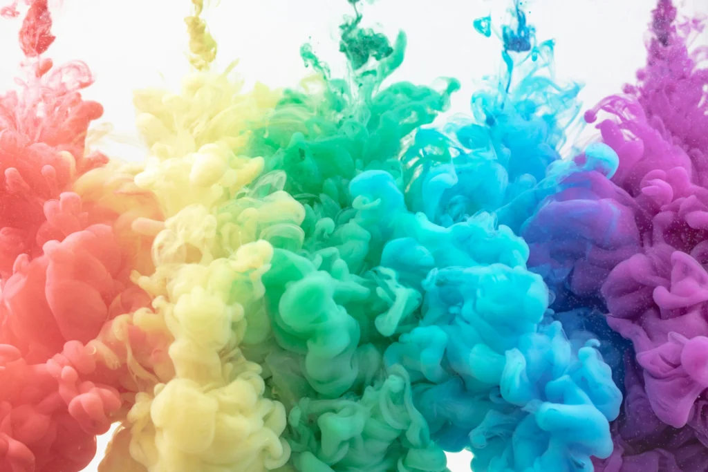
Psychological Impact of Color
Every color brings its own emotional punch. Warm shades like red and orange stir up energy and a sense of ease. Cooler ones, such as blue or green, bring a quiet calm and time for thought. In places like hospitals or schools, folks pick gentle colors to build a feeling of safety and clear thinking. Retail spots, on the other hand, go for strong colors to grab eyes and spark joy. The trick is finding the right mix. Too much bold color can tire people out. Not enough might leave the place feeling empty and cold.
Cultural Meaning of Color
Colors mean different things in various places around the world. White can stand for cleanliness in one spot but sadness in another. Architects on global jobs need to think about these differences. They must avoid mix-ups. For instance, old Japanese buildings often use natural wood colors. These show a peaceful link to nature. In sunny Mediterranean homes, bright whites and blues match the ocean and clear skies. It’s fascinating how a single hue can shift stories across borders.
Functional Use of Color in Space Definition
Color does more than stir feelings or symbols. It helps mark off areas inside a building. A small shift in shade can show the change from open public spots to private corners. No walls needed. Museums pick soft color schemes. This lets the art pop without distraction. Offices use clashing colors to split team areas from quiet nooks. When done with care, color turns into a quiet helper for finding your way around spaces.
Why Is Texture Essential in Architectural Expression?
Texture adds a touchable side to buildings. It makes materials feel real under sunlight or your fingers. Smooth concrete or bumpy stone changes how you sense size, heaviness, and truth in the build.
Material Authenticity
These days, picking real materials matters a lot. Exposed brick or raw wood shows honest work. These rough or natural feels speak of skill and lasting strength. People today want that real touch. They shy away from fake stuff that looks too perfect. In my view, nothing beats the warmth of a hand-laid stone wall—it’s like the building breathes.
Interaction Between Light and Texture
Daylight works magic on texture as hours pass. Early sun skims a bumpy front and casts fun shadows that make it dance. At dusk, man-made lights highlight layers or designs. Builders often use computer models first. They guess how these feels will act in rain or shine. Take a rainy day, for example—water on rough siding can gleam in ways software barely catches.
Sensory Experience of Texture
Texture hits more than your eyes. It calls for a hand to feel it. It sparks old memories. Bumpy rock brings back thoughts of old ruins. Shiny marble hints at fancy life. Soft cloth walls soak up noise for better sound in a room. Mix a few textures in one spot, and you build deep feelings. Users stay hooked as they walk through. I’ve seen kids in parks reach out to textured benches—it’s that inviting.
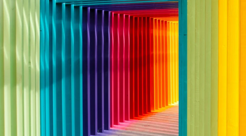
How Do Color and Texture Work Together in Design Harmony?
Color and texture blend well, and buildings get a deeper emotional pull. Their mix sets the mood stronger than one alone. It’s like adding spices to a plain dish—suddenly, everything pops.
Complementary Balance
Sleek surfaces with rich colors give off a classy air. Bumpy ones with plain shades feel solid and natural. Good matches stop things from looking dull. They keep everything tied together across stuff like wood or metal. Balance here means no one part shouts over the rest.
Depth Creation Through Contrast
Differences boost how deep a space looks. Dull finishes next to shiny ones, or dark spots against bright, add a beat to walls or outsides. You see this a lot in simple designs. Tiny changes take the place of fancy extras. In a quick office build I recall, just swapping matte doors for glossy frames made the hallway feel twice as long.
Emotional Resonance Through Unity
When color and texture match the goal, they create warmth and a sense of home. Think warm wood shades with gentle cloth feels. This match builds a story in the building. Each pick adds to the tale of that place. Unity like this pulls people in emotionally.
What Are Common Mistakes When Applying Color and Texture?
Even pros slip up sometimes with color and texture. They forget to hold back or check the setting around.
Overuse of Bold Colors
Piling on too many bright shades fights for the spotlight. It doesn’t help each other out. Big buildings do better with calm sets of colors. Use pops of strong ones just for main parts. This way, nothing drowns out the rest. Overdoing it can turn a welcoming lobby into a headache zone.
Ignoring Environmental Context
A flashy outside might shine on a screen. But in real life, it could bump heads with nearby trees or homes. Always check the spot first. Let the land or city guide your color picks. This helps the building fit right in. Ignore it, and your dream design feels out of place, like a neon sign in a quiet village.
Neglecting Maintenance Considerations
Some textures, like open stone or flat paint, wear down in unique ways over years. Skip planning for upkeep, and the look fades unevenly. What started sharp ends up messy. This twists the whole idea. Pros now add about 20% extra time in budgets just for these checks—it’s a smart move from past lessons.
How Does Technology Support Decisions About Color and Texture?
New tech tools change how builders test looks before breaking ground. They make choices safer and faster.
Virtual Modeling Tools
Programs for 3D pictures let you fake light from summer highs to winter lows. See how shades change on walls in real time. This cuts down surprises when picking stuff. No more guessing games. In one project, a team saved weeks by spotting a color flop in virtual sunsets.
Material Databases
Websites list tons of finishes now. From shiny metals to reused mixes. Each comes with facts on how long they last, how they bounce light, or if they keep heat in. These help match pretty looks with green goals. Designers grab ideas quick. It’s like having a huge shop catalog at your desk.
AI-Driven Visualization
New smart programs look at old jobs and guess good color sets for you. They spot what works well. But tech speeds things up. Still, people need to add heart. Machines miss the feel of a space. Human touch catches those small emotional bits algorithms skip. Blending both keeps designs alive and true.
How Do You Apply These Principles in Real Projects?
Ideas only click when you see them built. Color and texture back up what a place needs or stands for. Real spots show this best.
Residential Spaces Emphasizing Comfort
Homes aim for easy living. Soft gray walls pair with touchy fabrics for calm vibes. They keep things classy too. Real wood floors add heat without crowding tiny rooms. In a family house I know, adding woven rugs over smooth tiles turned a cold floor into a cozy nest—kids loved it.
Commercial Buildings Expressing Brand Identity
Business hubs turn company colors into building highlights. Tinted glass matches logos nicely. Textured metal sides last long and look fresh. This ties the look to the brand. For a tech firm, blue accents on steel panels echoed their logo and drew in clients right away.
Public Architecture Promoting Inclusion
Community spots use mixed materials like brick patterns or wall art from locals. Texture pulls people to touch and join. Color shows off different backgrounds, not sameness. In a city park center, murals in vibrant reds and yellows reflected neighborhood stories. It made everyone feel part of it.
FAQ
Q1: What role does natural light play in emphasizing color?
A: Natural light shifts how colors show up as the day goes on. Morning rays make shades gentler. Midday glare boosts them strong in rooms with big windows. This play can make a breakfast nook feel sunny and alive by 8 a.m., but cooler by evening.
Q2: Can texture affect acoustic performance?
A: Yes, bumpy textures spread sound better than flat ones. They cut down echoes. This helps big rooms like halls or busy offices. In a school auditorium with rough walls, noise dropped by half—teachers noticed the difference right away.
Q3: How do sustainable materials influence aesthetic outcomes?
A: Green picks like bamboo or reused concrete add special feels. They show care for the earth. Looks stay rich, much like old standbys. One eco-home used bamboo panels that aged to a soft glow, blending style with planet-friendly facts.
Q4: Is there a universal rule for choosing color combinations?
A: No one rule fits all, since what you see depends on the spot. But shades that match in strength often work well. They keep things even for most places. Pairing earth tones with a single bright accent has saved many dull rooms in my experience.
Q5: Why should architects test material samples physically?
A: Screens can’t match the feel under your hand or true light shifts. Real bits show tiny details key to picks. Holding a stone sample in sunlight reveals colors digital pics miss. It’s why pros swear by sample boards over pixels alone.