The Role of Color and Texture in Architectural Design
Architectural design goes beyond just strong structures or careful space planning. It acts as a visual way to share ideas through color and texture. These elements shape how folks feel about a building, both inside and out. They affect emotions, thoughts, and even physical reactions. In today’s buildings, smart choices of color and texture help create a unique look. They set the mood and change how light plays with the area. This piece looks at the close links between these touchy-feely parts and everyday building design work. Sometimes, I think about how a simple wall color can turn a dull room into something welcoming, like in cozy cafes I’ve visited.
How Does Color Influence Architectural Perception?
Color works quietly but strongly in building design. It sets the feel of a place. It points out shapes and even steers how people move around inside. Picture stepping into a room with soft blue or gray walls. It often seems peaceful and far away. Brighter reds or earthy browns bring people closer and add some zip. Builders use these effects to plan out feelings in spaces. For example, in a busy office, a splash of green might calm nerves during long meetings.
Psychological Impact of Color
Color’s effect on the mind sits at the heart of building choices. Research points out that some shades can cut down stress or boost focus. Take hospitals. They pick gentle greens and blues to help patients relax. Schools go for lively yellows to spark kids’ ideas. In shops, sharp color jumps grab eyes and sway buying choices. One study from a few years back found that blue walls in waiting rooms dropped anxiety by about 20 percent—handy for stressed-out visitors.
Cultural Symbolism of Color
Local ways of life shape what colors mean. In the West, white stands for clean lines or plainness. But in some Asian spots, it links to sadness. So, for projects across borders, builders need to think about home meanings to dodge wrong signals. Big companies tweak their building colors to fit in. McDonald’s, for one, tones down colors in old town areas to match the neighborhood vibe. It’s a small nod that makes locals feel at ease.
Functional Role of Color in Space Definition
Color does more than stir feelings or symbols. It marks off areas in wide-open floors. It lights up paths in big public spots like airports or clinics. Small shade shifts build order without walls. This trick shows up a lot in simple building styles. In a modern home, a darker hall color might guide you smoothly to the kitchen without signs.
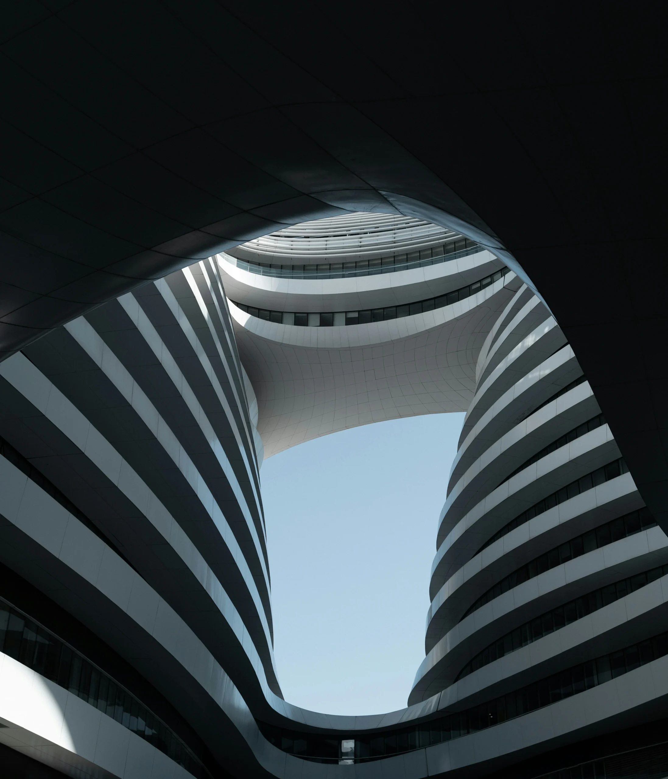
Why Is Texture Essential in Architectural Design?
Texture brings layers to building sides by mixing touch and view. It turns plain stuff into lively moments with light bounces and dark spots. From sleek concrete to bumpy stone fronts, textures give personality and realness. I’ve seen how a rough brick wall in a park makes the whole area feel lived-in and inviting, not sterile.
Material Expression Through Texture
Every stuff shares its tale via feel. Brick gives a cozy, old-time warmth. Glass hints at clearness and newness. Wood calls up nature’s touch. Builders tweak these traits to match their story. Look at Tadao Ando’s smooth concrete. It brings quiet through exact work, not fancy add-ons. In rainy places, that concrete holds up well, staying crisp for decades.
Light Interaction With Textured Surfaces
Feel changes how light acts on sides. Bumpy feels spread light gently, cutting shine. Sleek ones boost light and sharpness. In buildings that use mostly sun, like art spots or showrooms, this mix matters big for the mood. No need for extra lamps. A gallery I toured once had wavy walls that softened sunlight, making paintings pop without harsh spots.
Human Sensory Connection
Texture links people’s senses to made shapes. Folks naturally react to touch hints. Cold metal bars feel factory-like. Rough rock floors feel solid. Brain studies say mixing senses helps remember places better. So, bumpy spots stick in mind more than flat ones. Think of a stone path in a garden—it grounds you, making the walk memorable on a sunny day.
How Do Color and Texture Work Together?
Color and texture seldom go alone. Their team-up makes the whole building feel right. A dull side soaks up color unlike a shiny one. This shifts how things look, even with the same shade. It’s like how paint on wood looks deeper than on metal—subtle but key.
Harmonizing Visual Balance
Good mix comes when color strength matches feel changes. Plain colors count on deep textures for fun. Picture stone covers with wood touches. Bright shades pair well with even finishes to avoid too much buzz. In a hotel lobby, soft beiges on rough walls keep things calm yet interesting.
Emotional Resonance Through Combination
Paired right, color and feel stir clear feelings. Baked clay walls give off heat. Cool stone floors shout fancy. Rusty metal sheets show toughness. This pair lets builders make moods that fit the job. Guest spots might pick soft shades with gentle feels. Office areas go for sharp lines. One restaurant I know uses warm oranges on bumpy plaster to make diners linger longer, boosting the cozy chat over meals.
Influence on Spatial Perception
The pair also tweaks how big spaces seem. Dark bumpy sides pull back, so rooms look wider. Light shiny ones push ahead, making spots snug. Smart builders use this sight trick to fix sizes without big changes. In tight apartments, a glossy white wall can make the living area feel twice as roomy.
What Are the Practical Considerations When Selecting Colors?
Picking colors means checking real-world stuff, not just looks. Think about how long they last, upkeep, light setups, and the world around. It’s practical planning that saves headaches later. For instance, in a seaside town, wrong colors could fade fast from salt air.
Environmental Contextualization
Shades act different in all sorts of weather or lands. Dry spots like deserts pick dirt-like tones to mix with the land. Beach buildings use bright whites to push back heat. Green building now pulls in local dyes from nearby stuff for earth-friendly fits. A project in Arizona used local red clay paints that blended perfectly, cutting down on that “outsider” feel.
Durability Under External Conditions
Sun rays bleach colors as time goes. Dirt clouds make fronts dingy. Wet air shifts how deep they look. Tough paints now keep shine longer. This matters for city works where fixing up costs a bundle. In polluted cities like London, these coatings last up to 15 years without much fade, based on builder reports.
Lighting Integration
Man-made lights change how colors show up a ton. LED bulbs might make warm shades feel cold after dark. So, planners test samples under all kinds of lights before saying yes. It’s a step that catches surprises early. During a site visit, I saw how evening lights warmed up a cool gray facade nicely.
How Does Digital Technology Affect Color and Texture Application?
New tech tools change how builders picture color and feel ties in early stages. It makes planning smoother and cuts errors. Tools like these have sped up designs in firms I’ve followed, dropping rework by half in some cases.
Virtual Simulation Tools
Programs such as BIM let you see stuff in real time under changing lights. This guesses looks spot on before building starts. No more wild guesses. Architects can tweak on screens, saving time and cash.
Parametric Design Influence
Curvy modeling pulls in weather info, like sun tracks or how stuff bounces light. It balances good looks with solid work at once. This approach shines in hot climates, where it helps pick shades that stay cool all day.
3D Printing Material Innovation
New making methods create custom feels straight from computer plans. They use green mixes or reused plastics. This opens up fresh ideas while helping the planet. Imagine printing a wavy wall panel that fits just right—it’s happening in labs now.
How Do Cultural Trends Shape Modern Use of Color and Texture?
Today’s buildings mirror changing ways of life. They stress realness, green ways, and full senses over showy bits. It’s a shift toward honest designs that feel human. In cities, this means more parks with natural textures that invite touch.
Minimalism Versus Maximalism Movements
Simple styles stick to one-color sets with light feel shifts. Busy trends mix bright shades with stacked stuff like speckled floors or tiled patterns. This back-and-forth shapes city views now. Minimal spots feel clean, while max ones buzz with life—both have their fans.
Sustainable Material Aesthetics
Used wood lines or raw concrete flaws now shine as signs of time, not hides. It’s a mind change that ties pretty to green duty, not spotless looks. Builders love how reclaimed barn wood adds warmth without new cuts.
Regional Identity Preservation
Home skills come back strong as idea wells. Mud builds in South America or cane weaves in Southeast Asia keep old ways in a world mix. This holds culture tight in big projects. A village hall in Mexico with local adobe keeps traditions alive amid modern builds.
FAQ
Q1: What Is the Relationship Between Color Temperature and Mood?
A: Warm colors such as red or orange create energy while cool shades like blue induce calmness due to psychological associations rooted in natural phenomena like fire versus water reflection cycles (source: Journal of Environmental Psychology 2022). It’s fascinating how these ties go back to basic survival instincts.
Q2: Can Texture Influence Acoustic Performance?
A: Yes, rougher surfaces diffuse sound waves effectively reducing echo levels—a principle applied widely in theaters and recording studios (source: Architectural Acoustics Handbook 2021). In one concert hall, added bumps cut noise by 30 percent, making shows clearer.
Q3: How Do Architects Test Color Combinations Before Construction?
A: They employ digital renderings alongside physical sample boards viewed under various lighting settings ensuring accurate real-world translation (source: American Institute of Architects Guidelines 2023). This mix catches odd shifts that screens alone miss.
Q4: Are There Universal Rules for Choosing Building Colors?
A: No universal rule exists since climate, culture, function all dictate palette selection though neutral bases remain adaptable across contexts (source: RIBA Design Standards 2020). Neutrals like grays work almost anywhere, but tweaks make them shine locally.
Q5: What Future Trends May Redefine Texture Application?
A: Smart materials capable of changing surface roughness dynamically based on temperature or user interaction are emerging research areas promising new tactile experiences (source: Materials Today Journal 2024). Picture walls that soften when you lean in—wild but possible soon.