
What bed room decor Trends Define the Calming Paint Colors Designers Love for 2026
The Calming Bedroom Paint Colors Designers Love for 2026
The color direction for 2026 bedroom décor moves toward quiet sophistication. Designers are prioritizing wellness-centered palettes that foster rest, emotional clarity, and sensory balance. Soft neutrals, mineral-inspired hues, and sustainable pigments define this shift. The modern bed room decor now merges mental well-being with environmental responsibility, creating spaces that feel restorative yet refined. In professional design circles, calming paint colors are no longer just aesthetic choices—they serve as tools for psychological comfort and spatial harmony.
Evolving Aesthetic Directions in Bedroom Décor for 2026
The next wave of bed room decor emphasizes emotional wellness and environmental awareness. As living spaces become sanctuaries from overstimulation, designers aim to create interiors that soothe rather than impress.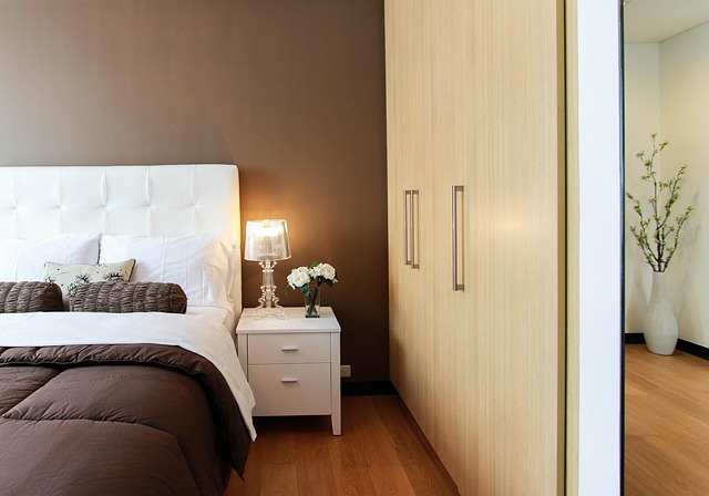
The Shift Toward Wellness-Centered Design
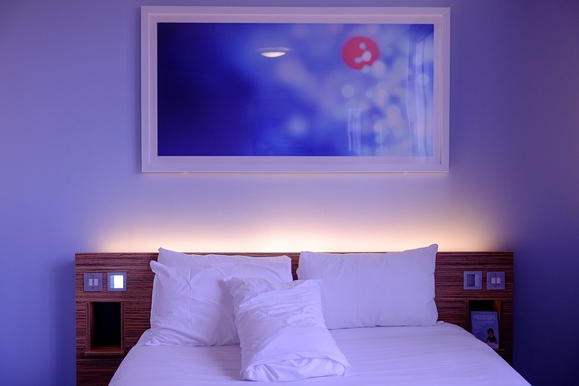
Designers in 2026 are focusing on restful environments that promote mental clarity and emotional balance. Bedrooms are being treated as recovery zones where visual calm replaces decorative excess. Calming paint colors such as muted greens or soft grays help slow the mind’s rhythm after digital-heavy days. Minimalist layouts—clean lines, uncluttered surfaces—further support this intention by reducing visual noise and allowing the eye to rest naturally.
Influence of Sustainability on Color Selection
Sustainability now drives both material choice and color psychology in interior design. Low-VOC paints and eco-conscious finishes have become standard practice among premium brands. Natural pigments derived from clay, chalk, or plant sources dominate the palette for 2026 because they carry both tactile warmth and ecological integrity. This merging of sustainability with luxury is evident in finishes like matte limewash or mineral-based plasters that diffuse light softly while maintaining a handcrafted appeal.
Defining Calming Paint Color Palettes for 2026
Color trends for bedrooms are evolving toward subtlety and restraint. Designers are choosing hues that interact gently with light and texture rather than dominate them.
Emerging Neutrals and Muted Hues
Soft taupes, sand tones, and warm grays form the backbone of contemporary calming palettes. These shades act as flexible backdrops, allowing layering with natural fabrics or textured furniture without overwhelming the space. Matte or eggshell finishes remain preferred because they scatter light evenly across walls, producing a velvety softness ideal for tranquil interiors.
The Rise of Botanical and Mineral-Inspired Shades
Botanical greens, clay reds, and stone blues continue to gain traction among color experts. These tones evoke nature’s grounded calmness while connecting indoor environments to outdoor landscapes—a principle aligned with biophilic design philosophy. When paired with organic fabrics like linen or raw cotton, these hues build depth through subtle tonal variation rather than contrast.
The Role of Light in Color Perception
Lighting plays an essential role in how calming paint colors behave throughout the day. Natural daylight shifts warm tones cooler in morning hours while artificial lighting can either flatten or enrich color depth depending on its temperature. Warm LED lighting between 2700K–3000K enhances soft neutrals by adding a gentle amber glow that supports evening relaxation cycles.
Integrating Calming Colors into Bedroom Design Concepts
Applying these palettes effectively requires sensitivity to texture, proportion, and finish selection. Designers approach wall color not as a background but as part of an integrated sensory experience.
Harmonizing Paint with Textural Elements
Muted wall tones gain character when combined with tactile materials such as linen drapes, wool throws, or unfinished oak furniture. This interplay prevents minimalism from feeling sterile while preserving serenity. Tonal layering—using slightly varied shades within one color family—creates dimension without cluttering visual space.
Complementary Accents and Finishes
Metallic accents like brushed gold lamp bases or bronze hardware add understated sophistication without disrupting calmness. Accent walls painted a tone deeper than adjacent surfaces can subtly shape perception of depth while maintaining balance. Even small details such as trims painted in analogous hues help create seamless transitions between architectural elements.
Psychological and Emotional Impact of Calming Palettes
Color psychology remains central to bedroom design strategy for 2026. Designers now treat hue selection as part science, part emotional mapping.
How Color Influences Restfulness and Mood Regulation
Cool undertones—think blue-gray or sage—help lower perceived temperature and visual stimulation levels, which encourages physical relaxation. Desaturated hues reduce cognitive load by minimizing contrast intensity; this aids decompression after long work hours or screen exposure. Slightly lighter ceilings than walls can expand perceived height and improve spatial comfort.
Designer Insights on Emotional Resonance in Color Choice
Professionals emphasize intuitive palette selection shaped by client lifestyles rather than fleeting trends. For instance, clients who travel frequently may prefer consistent neutral bases that feel grounding upon return home. Emotional resonance emerges when personal rhythm aligns with environmental cues—a concept increasingly explored through environmental psychology research within interior practice.
Future Outlook: The Next Phase of Bedroom Color Evolution Beyond 2026
As technology integrates deeper into domestic life, future bedroom palettes will adapt dynamically rather than remain static.
Integration of Technology with Calming Aesthetics
Smart lighting systems capable of adjusting hue intensity based on circadian rhythms will become mainstream in high-end projects by late 2020s. These systems maintain alignment between biological cycles and ambient color temperature throughout the day. AI-assisted design tools are also emerging to simulate emotional responses to specific color combinations before final application—offering data-driven personalization previously unavailable to designers.
Expanding the Global Influence on Calming Color Trends
Globalization continues shaping aesthetic sensibilities through cross-cultural exchange. Scandinavian restraint still informs minimalist palettes built around pale woods and foggy whites, while Japanese wabi-sabi aesthetics inspire muted earth tones celebrating imperfection and tactility. Increasingly hybrid global palettes combine these influences into cohesive expressions of universal serenity suitable for diverse climates and lifestyles.
FAQ
Q1: What defines a calming paint color in bed room decor?
A: It’s typically a desaturated hue—neutral or nature-derived—that reduces visual tension while promoting restfulness through balanced undertones.
Q2: Why are sustainable paints important for bedrooms?
A: Bedrooms benefit from low-VOC paints because they minimize indoor pollutants that could disrupt sleep quality or respiratory comfort over time.
Q3: How do lighting choices affect calming color perception?
A: Warm LEDs enhance depth in soft neutrals at night whereas cooler daylight reveals undertone variations during morning hours.
Q4: Which textures pair best with muted wall colors?
A: Natural fibers like linen or wool complement matte finishes beautifully since both absorb light softly rather than reflecting it harshly.
Q5: Are bold colors completely out for 2026 bedroom trends?
A: Not entirely—designers may use deeper accent shades sparingly to anchor space composition while keeping overall atmosphere serene.