
How Can Art for Above Bed Transform a Textile-Focused Interior Design
Here’s How to Style Textile Art Like an Interior Designer
Textile art above a bed is more than decoration; it’s a balancing act between material richness and visual calm. Expert designers treat the wall as an extension of the fabric story, not its rival. The key lies in proportion, color rhythm, and tactile dialogue between art and textiles. When executed well, the artwork becomes both a focal point and a mediator—tying together bedding, upholstery, and lighting into one cohesive composition.
The Role of Art for Above Bed in Textile-Focused Interior Design
In textile-driven interiors, every surface carries weight—literally and visually. Fabrics dominate with texture and pattern, so wall art must find its place without overwhelming the space. The art for above bed serves as a visual punctuation mark that organizes the sensory density of fabrics into a coherent narrative.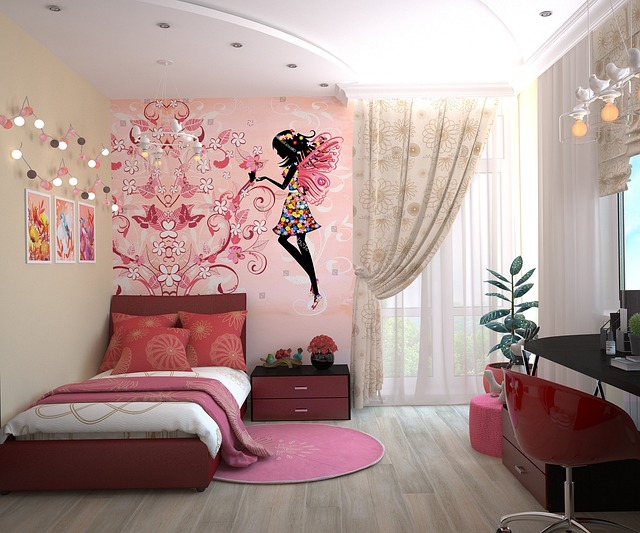
Understanding the Visual Balance Between Textiles and Wall Art
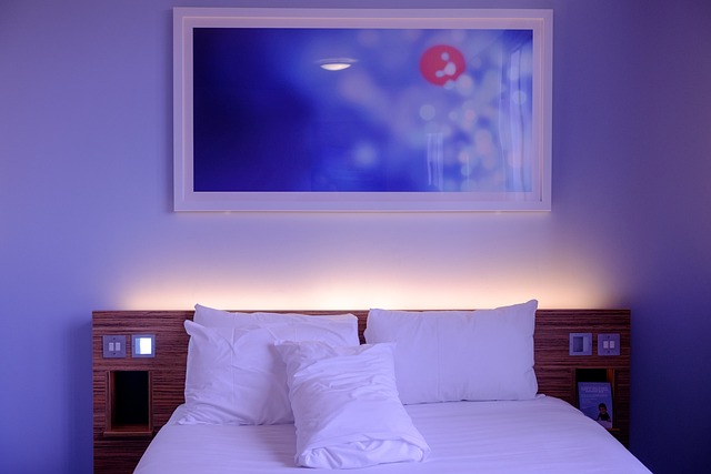
Textile-heavy interiors often feature layered materials: linen headboards, velvet cushions, woven throws. The wall art must echo this richness while maintaining clarity. A framed piece that mirrors the softness of fabrics through muted tones or textured paper can maintain equilibrium. Scale plays a major role; oversized works can overpower intricate bedding patterns, while too-small pieces get lost among plush surroundings. Designers often recommend aligning artwork width to about two-thirds of the bed’s width to maintain proportional harmony.
Integrating Art as a Focal Point in a Textile-Dominant Space
In rooms where textiles dominate, strategic placement of artwork helps anchor visual rhythm. A centered piece above the bed visually stabilizes cascading layers of pillows and throws. Color coordination is essential: matching undertones between fabrics and paint strokes creates unity, while deliberate contrast injects energy. Framing also matters—wood frames pair well with natural linens, while brushed metal complements modern weaves or silk textures.
Selecting the Right Type of Art for Above Bed Spaces
Choosing art for above bed requires sensitivity to material interplay. The artwork must feel like part of the textile conversation rather than an afterthought pinned to the wall.
Textile-Based Artworks as an Extension of Interior Materials
Fiber art or macramé installations can extend textile narratives upward from the bed. A handwoven tapestry introduces depth without cluttering visual space. Layering different fiber mediums—say cotton cords with wool threads—adds dimension while maintaining softness. Natural fibers such as jute or hemp reinforce authenticity in handcrafted design schemes often seen in bohemian or organic-luxury bedrooms.
Mixed-Media and Non-Textile Artworks in Textile Interiors
When textiles already dominate, non-fabric artworks provide balance. Abstract paintings with broad brushstrokes can break up repetitive fabric patterns, introducing breathing space for the eye. Prints featuring subtle metallic inks or glass-framed compositions reflect light softly across plush surfaces like velvet duvets or chenille throws. Such contrast prevents monotony while adding sophistication.
Color Theory and Material Harmony in Bedroom Art Styling
Color ties everything together in interior composition. For textile-rich bedrooms, color coordination between bedding and wall art defines whether the space feels serene or stimulating.
Coordinating Color Palettes Between Bedding and Wall Art
Repeating accent colors across cushions and artwork builds continuity—for example, echoing a terracotta stripe from a pillow within an abstract canvas detail unifies disparate elements. Monochromatic schemes emphasize texture over hue variation; this approach suits minimalist aesthetics where tactile quality replaces color drama. Conversely, complementary pairings like navy against soft beige textiles enliven neutral settings without disrupting calmness.
Material Interplay: From Fabric Weaves to Artistic Mediums
Material perception shifts depending on what surrounds it. Coarse linens make matte canvas appear smoother; silk bedding enhances gloss finishes on painted surfaces. Designers often play with opposites—pairing soft weaves with hard-edged frames—to balance tactile sensations within one visual field. This interplay defines spatial depth and contributes to sensory comfort crucial for restful environments.
Scale, Proportion, and Spatial Composition Above the Bed
The relationship between artwork size and surrounding textiles determines overall coherence. Too much dominance from either side distorts balance; precision is key.
Determining Appropriate Artwork Dimensions for Textile Contexts
Large-scale pieces deliver impact but should align with both headboard height and mattress width to avoid awkward spacing. Smaller grouped artworks can mimic textile repetition patterns found in quilts or embroidery motifs, creating rhythmic harmony across vertical planes. Leaving negative space around art allows fabrics below to breathe visually—a subtle yet vital design decision.
Layering Techniques for Depth and Dimensionality
Layering extends beyond fabrics—it’s also about how textures interact across planes. Combining wall-mounted art with layered cushions creates physical depth that reads naturally under soft lighting. Floating shelves positioned above headboards can hold framed miniatures alongside folded quilts or ceramic accents that echo textile tones below.
Curatorial Approaches to Integrating Art into Textile-Centric Bedrooms
Curating bedroom art involves storytelling through texture and form rather than collecting random pieces that happen to match colors.
Developing a Cohesive Narrative Through Texture and Form
Every successful design tells a consistent story—whether it’s organic minimalism expressed through linen panels or bohemian luxury via embroidered tapestries. Repetition of motifs across both fabric prints and wall compositions strengthens thematic direction without appearing contrived. Curated restraint distinguishes professional styling from cluttered amateur setups by allowing each element room to resonate.
Advanced Styling Techniques Used by Interior Designers
Designers frequently test arrangements digitally before installation to evaluate hierarchy between textiles and artwork scale. Custom framing paired with bespoke upholstery offers tailored cohesion rarely achieved through off-the-shelf solutions. Some professionals rotate artworks seasonally—lighter palettes during summer months complement airy linens while richer tones enhance winter velvets—keeping interiors dynamic without changing core furnishings.
Lighting Strategies for Enhancing Art Above Bed Installations
Lighting bridges material perception between fabric texture and artistic surface finish. It transforms static decoration into dynamic experience.
The Interaction Between Light, Texture, and Artwork Surface
Directional lighting reveals both brushstroke reliefs on paintings and weave irregularities on nearby textiles simultaneously, enhancing tactile realism under controlled illumination angles. Warm light temperatures bring out natural fiber warmth in cotton or wool works; cooler tones emphasize reflective surfaces like metallic frames or glass overlays used in modern compositions.
Integrating Lighting Fixtures into Overall Design Language
Lighting fixtures should blend seamlessly into textile context rather than stand apart as technical additions. Wall sconces finished in linen shades echo surrounding softness while recessed lights maintain minimalism suited for contemporary rooms. Diffused beams prevent glare on framed glass yet preserve true pigment values within artworks—a small but critical detail distinguishing expert-level installations from casual setups.
FAQ
Q1: How large should art above a bed be?
A: Ideally about two-thirds of the bed’s width so it aligns proportionally without overpowering textile layers beneath it.
Q2: Can textile-based artworks replace traditional paintings?
A: Yes, fiber arts such as woven panels offer tactile continuity especially effective in fabric-dominant interiors where softness prevails.
Q3: What frame materials work best with heavy fabrics?
A: Wood complements natural fibers like linen or cotton; metallic finishes suit sleek synthetics or silk textures needing contrast.
Q4: How does lighting affect textile art presentation?
A: Directional warm light enhances depth by emphasizing weaves while cooler light sharpens reflective surfaces like glass-framed prints.
Q5: Should artwork color always match bedding tones?
A: Not necessarily; subtle contrast often enriches composition more effectively than perfect matching when handled deliberately by designers.