
Is Living Room Interior Design Shifting Toward Earthy Paint Palettes in 2026
Paint Trends Taking Over Living Rooms Everywhere In 2026 (So Far)
Color direction in 2026 is taking a distinctly organic turn. Living room interior design is moving away from cold minimalism and into palettes that evoke soil, stone, and sun-warmed clay. Designers are embracing natural pigments and tactile finishes that express calmness, authenticity, and ecological awareness. This shift isn’t just aesthetic—it’s cultural. The rise of earthy hues mirrors global priorities around sustainability, wellness, and emotional grounding at home. The result is a new kind of modern: one that feels rooted, restorative, and quietly luxurious.
Emerging Color Directions in Living Room Interior Design for 2026
The color evolution shaping living room interiors reflects more than seasonal preference; it captures a deeper social mood. As people seek comfort in uncertain times, the palette turns to nature for reassurance.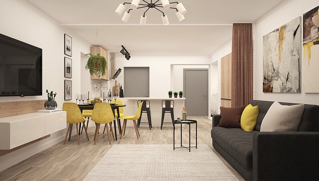
The Broader Shift Toward Natural and Earth-Inspired Aesthetics
Designers are emphasizing organic tones that evoke calm and connection to nature. Soft ochres, muted greens, and gentle taupes mimic landscapes rather than laboratory precision. Earthy palettes align with sustainability trends and wellness-focused living spaces by promoting environmental consciousness through color choice. The preference for grounded hues reflects a move away from sterile minimalism toward warmth and tactility—an aesthetic that feels lived-in rather than curated.
How Global Influences Are Shaping Color Preferences
Globalization has made regional aesthetics more visible than ever. Cultural emphasis on environmental awareness is driving natural color adoption in both Western and Eastern markets. Regional materials and landscapes inspire palette variations across markets; Mediterranean interiors lean toward terracotta and sand tones, while Nordic spaces favor moss greens and cool stone neutrals. The influence of biophilic design continues to grow in residential interiors as architects integrate plant life, daylight, and natural finishes into everyday living.
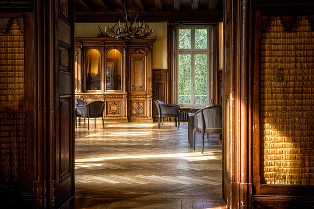
Defining the Earthy Palette in Contemporary Living Rooms
The earthy palette dominating living room interior design isn’t monolithic—it’s a spectrum of nuanced undertones shaped by material context and light behavior.
Core Characteristics of Earthy Color Schemes
An earthy scheme typically includes muted browns, soft greens, warm terracottas, and clay-inspired neutrals. These tones create visual warmth and tactile comfort within living environments by echoing natural textures like soil or bark. Layering textures enhances the depth and authenticity of these color choices; pairing matte walls with woven fabrics or raw ceramics prevents flatness while maintaining cohesion.
Integration of Natural Materials With Paint Choices
Paint colors are being paired with stone, wood, linen, and rattan finishes to achieve harmony between surface and pigment. Designers use matte or chalk finishes to mimic natural surfaces instead of high-gloss coatings that reflect artificiality. Harmonizing paint with material palettes strengthens spatial coherence—olive-green walls beside oak shelving or sienna accents against travertine tiles produce understated sophistication.
Design Psychology Behind the Earthy Palette Trend
Color psychology underpins much of this movement toward grounded tones. Emotional well-being has become central to spatial planning since the pandemic redefined domestic life as sanctuary.
Emotional Impact of Grounded Tones in Shared Spaces
Warm neutrals promote relaxation and social comfort in communal areas such as living rooms where people gather most often. Earth-based hues foster a sense of permanence and security post-pandemic when stability became aspirational. Subdued palettes reduce visual noise, enhancing perceived spaciousness even in compact apartments—a subtle but powerful psychological effect.
The Role of Light and Texture in Perceived Mood
Diffused lighting complements muted earthy tones effectively by softening shadows and highlighting texture variation rather than sheen. Textural layering prevents monotony within tonal restraint; think boucle upholstery beside plastered walls or wool rugs under timber furniture. Variations in finish—matte versus satin—alter emotional perception subtly: matte absorbs light for intimacy while satin reflects enough brightness to keep energy balanced.
How Technology Is Influencing Paint Formulation and Selection
Technology now plays an unexpected role in how designers choose “natural” colors. Innovation is making sustainability measurable rather than merely aspirational.
Advances in Sustainable Pigments and Finishes
Eco-friendly pigments now replicate natural tones without environmental impact thanks to mineral-based chemistry advances verified by ISO environmental standards. Low-VOC formulations support health-conscious interior design practices by improving indoor air quality—critical for urban dwellings with limited ventilation. Digital tools assist designers in visualizing earthy palettes under varied lighting conditions through photometric simulation software widely used across architectural studios.
AI-Assisted Color Forecasting for 2026 Trends
Predictive algorithms analyze consumer sentiment toward natural aesthetics using data from social media imagery recognition models. AI-driven platforms identify emerging micro-trends within earthy color families such as mushroom gray or desert rose before they reach mainstream adoption cycles. Data insights guide manufacturers toward nuanced palette development so product lines anticipate emotional shifts rather than react to them.
Practical Applications for Designers Adopting Earthy Palettes
Implementing these palettes requires balance: too much neutrality risks dullness; too little coherence disrupts flow.
Balancing Earthy Colors With Modern Elements
Combining natural tones with metallic or glass accents maintains contemporary relevance without losing warmth. Strategic contrast through art or textiles introduces dynamic balance—a charcoal abstract print over clay-toned walls can ground a space visually while injecting vitality. Neutral bases allow flexibility for evolving décor updates over time as tastes shift subtly year to year.
Coordinating Paint With Furniture and Architectural Features
Wall colors complementing exposed brick, stone fireplaces, or wooden beams enhance cohesion between architectural bones and decorative layers. Selecting undertones that align with flooring materials ensures harmony across surfaces; beige paint with pink undertones suits oak floors better than yellow-based neutrals do. Accent walls or niches can emphasize architectural rhythm without overpowering space design intent when applied sparingly around focal points like window alcoves.
Anticipated Evolution Beyond 2026 in Living Room Color Strategy
The trajectory beyond 2026 suggests continuity rather than abrupt change—earthiness will persist but diversify through hybridization with mineral pigments.
Gradual Expansion Into Hybrid Natural-Pigment Palettes
Designers may blend earthy bases with mineral-inspired blues or muted ochres for complexity reminiscent of geological strata rather than pure soil tone simplicity. Cross-disciplinary collaborations between paint brands and textile houses will refine tonal accuracy using spectrophotometric calibration ensuring consistency from wall to fabric dye lots.
Long-Term Implications for Residential Aesthetic Identity
The sustained interest in earth-derived palettes signals a redefinition of luxury as authenticity-driven design where imperfection equals charm. Future interiors may prioritize sensory tactility over visual spectacle—hand-finished plaster replacing synthetic gloss—to reinforce human-nature connection through color choice continuity across decades rather than seasons.
FAQ
Q1: Why are earthy tones becoming dominant in living room interior design?
A: They reflect cultural shifts toward sustainability, wellness, and emotional grounding while offering versatility compatible with both traditional craftsmanship and modern architecture.
Q2: Which specific shades define the 2026 trend?
A: Expect muted browns like umber, soft greens reminiscent of sage leaves, terracotta reds inspired by clay pottery, and beige-gray hybrids resembling river stone.
Q3: How does lighting affect earthy paint perception?
A: Warm light amplifies red or orange undertones creating coziness; cooler daylight emphasizes gray-green notes producing serenity without dullness.
Q4: Are sustainable paints more expensive?
A: Initially yes due to advanced pigment sourcing but lifecycle cost evens out since low-VOC paints improve durability and reduce maintenance frequency over years.
Q5: What’s next after the earthy palette phase?
A: Hybrid palettes integrating mineral blues or oxidized metal tints will likely dominate post-2026 blending organic familiarity with subtle industrial sophistication suitable for evolving urban lifestyles.