

Why Is the Art Deco Chrysler Building Still New York’s Most Iconic Skyscraper?
Why Does the Art Deco Chrysler Building Still Matter?
The art deco chrysler building is not just a bright tower at 405 Lexington Avenue. For people who work with buildings, branding, or city planning, it is a clear example of how an office tower can become a city marker, a business symbol, and a design reference almost a century after it opened. If you are comparing landmark forms across Building Styles, this building is a useful place to begin. Start with the crown, the setbacks, the metalwork, and the way small details turn business ambition into architecture.
A Skyline Symbol With Real Historical Weight
The National Park Service National Register record, published on December 8, 1976, lists the Chrysler Building under the areas of commerce, art, and architecture, with the architectural style recorded as Moderne. That mix is important because the building is not only about decoration. It is tied to industry, city growth, and design culture at the end of the 1920s.
A Commercial Tower With Personal Branding
Walter P. Chrysler did not pay for a plain office block. He wanted a personal symbol linked to progress, manufacturing, and public attention. The New York City Landmarks Preservation Commission report dated September 12, 1978, describes the tower as built from 1928 to 1930 for Walter P. Chrysler and designed by William Van Alen. The same report calls it an outstanding example of Art Deco architecture, and that wording comes from a public preservation body, not from a travel brochure.
A Style Guide Hidden in Plain Sight
For designers, the building reads like a working checklist. It has geometric pattern, strong entrances, polished metal, clear vertical lines, and machine-age ornament. Even so, it does not feel like a set of decorative parts fixed onto a frame. The pieces relate to each other, and from a taxi window on 42nd Street, the crown still tells you exactly which building you are looking at.
What Makes Its Art Deco Design So Easy to Recognize?
Art Deco can be a broad term, but the Chrysler Building makes the style easier to read. The Metropolitan Museum of Art, in its June 2010 essay on French Art Deco, links the style name to the 1925 Paris Exposition Internationale des Arts Décoratifs et Industriels Modernes and places the style largely between the two world wars. The Chrysler Building takes those design ideas and turns them into skyscraper form.
The Stainless Steel Crown and Spire
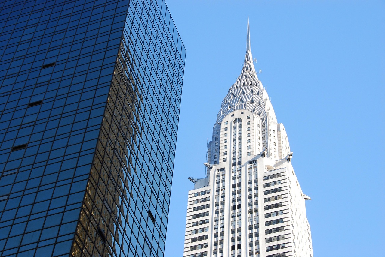
The crown is the part most people remember first. Its stepped steel arches, triangular windows, and thin spire catch light in a way brick cannot. The Council on Tall Buildings and Urban Habitat’s Skyscraper Center lists the building at 318.9 meters, or 1,046 feet, to its architectural top. The figure matters, but the visual effect matters more in daily use because the top gives the whole tower a face.
Automotive Ornament in the Facade
Look closer and the car references are very direct. The 1978 Landmarks Preservation Commission report notes huge ornamental Chrysler radiator caps around the thirty-first floor, each spanning about 15 feet, plus a frieze of stylized racing automobiles with polished steel hubcaps. That is branding, but not in the flat logo sense. It is branding built into stone, brick, and steel.
Geometry That Reads From the Street
Smarthistory’s 2017 discussion of William Van Alen’s Chrysler Building describes Art Deco as modern, urbane, and luxurious, with motifs such as chevrons, sunbursts, arcs, and machine-like forms. On this tower, those ideas can be read from a long distance. The zigzags, vertical strips, and triangular crown windows are not quiet details. They help people recognize the building at city scale, which is not easy to achieve.
How Did Height, Zoning, and Engineering Shape the Tower?
The Chrysler Building looks polished, but its form also came from rules and engineering needs. Many strong skyscrapers work this way. They take a limit, a race, or a site problem, and then turn it into shape. Here, zoning, steel construction, and a public height contest all pushed the design upward.
Setbacks Created by the 1916 Zoning Rules
The Landmarks Preservation Commission report states that the tower rises 77 stories in a series of setbacks that accord with the 1916 New York zoning ordinance. Those setbacks were not added as decoration at the end. They helped light and air reach the street, while also giving the building its stepped outline. You can see the rule in the form, but the result does not feel like paperwork.
The Secret Spire and the Height Race
The height race gives the building its best-known construction story. According to the same 1978 report, Van Alen designed a 185-foot spire that was fabricated in five sections, assembled secretly at the sixty-fifth floor, then lifted into place in about 90 minutes by a 20-ton derrick in November 1929. The move had some showmanship, no doubt. It was still serious engineering and tight site work.
Office Data Behind the Glamour
The Skyscraper Center lists 77 floors above ground, 32 elevators, and a tower gross floor area of 1,196,958 square feet. Those numbers are a useful reminder that the crown had to sit above a working office building. Daily routines, elevator trips, deliveries, meetings, and lunch breaks all happened below the silver top. A skyscraper can look like a landmark and still need to function as a workplace.
Why Did Materials Matter More Than Decoration?
It is easy to call the Chrysler Building decorative and leave it there. That misses much of the point. Art Deco used surface, but the better Art Deco buildings used surface to talk about new materials, industry, and city life. The Chrysler Building does that in a direct way.
Nirosta Steel as a Modern Signal
The 1978 Landmarks Preservation Commission report identifies Nirosta steel as a rust-resistant chromium-nickel steel used for exterior ornament, entry and window framing, the dome, and the spire. The report also notes that this steel was manufactured in the United States specifically for the Chrysler Building according to a German formula from Krupp. That is a detailed material story, not just a shiny finish. It shows how the building used metal as part of its message.
Brick, Marble, and Metal Contrast
The facade mixes white brick, gray and black brick, marble strips, aluminum spandrels, polished steel, and patterned metal. The contrast gives the tower depth without making it feel heavy. From a distance, you read the outline first. From the sidewalk, you notice the surface and texture, which is one reason the building still photographs well from difficult corners and not only from postcard views.
Practical Interiors for Fast Business
The Landmarks Preservation Commission report also records practical features: interchangeable steel office partitions, under-floor duct systems for telephone and electric wiring, fast elevators designed for 1,000 feet per minute even though 1930 city rules allowed lower operating speeds, plus an underground arcade connection to the IRT subway. These points are not small side notes. They show that the modern look was tied to modern use, office speed, and tenant service. See also: Building Layout.
How Does It Compare With Other Art Deco Skyscrapers?
No serious look at the Chrysler Building should ignore the wider Art Deco skyline around it. New York in the late 1920s and early 1930s had many towers trying to turn height into status. Some relied on mass, and some relied on program. Chrysler Building stood out through personality.
Empire State Building vs Chrysler Building
The Empire State Building became taller and more widely known in many ways, but the Chrysler Building often wins the personal reaction. The reason is fairly simple. The Empire State Building feels calm, broad, and civic. Chrysler Building feels quick, sharp, and a little playful. If the Empire State Building is the big public statement, Chrysler Building is the tailored suit with a flash of chrome at the cuff.
Rockefeller Center and the Civic Face of Deco
Rockefeller Center shows another side of Art Deco: planned urban space, public art, plazas, and commercial planning at district scale. Chrysler Building is more individual. It rises from its site as one clear object rather than as part of a larger complex. That difference helps explain why the tower can feel almost personal, even though it is a large office building.
Lessons for Today’s Facades
Contemporary towers often use glass skins and low-key branding. The Chrysler Building points to another option. A facade can carry identity through form, material, and repeated detail. It does not need large signage to explain itself. The radiator caps, eagle-head gargoyles, and crown do that work, and they still feel less dated than many corporate logos from recent years.
What Can Designers and Travelers Learn From It Today?
The Chrysler Building is worth studying for professionals and easy to enjoy for visitors. You can look at it as an architect, a preservation student, a New York traveler, or just someone who likes well-made buildings. In each case, it asks you to slow down and read the tower from the sidewalk to the top.
Look Up Before You Cross Lexington Avenue
At street level, notice the entrances first. The 1978 preservation report describes the Lexington Avenue and 42nd Street entrances as three-story proscenium-like openings, framed to heighten the drama of entering the building. After that, step back safely and follow the setbacks upward. The building changes as your eye moves higher, and the crown makes more sense when you have seen the base first.
Read Ornament as Brand Language
The automotive details are not random decoration. They connect the tower to Chrysler’s public image in the 1920s, when speed, production, and machine polish shaped American consumer culture. If you design buildings, interiors, or retail spaces, the lesson is useful. Brand language works better when it becomes part of the architecture, not a layer added after the main work is done.
Use Drama Without Losing Order
The Chrysler Building has drama, but it is not messy. The vertical window bands, repeated setbacks, and controlled materials keep the composition steady. That balance is why the tower can handle strong ornament without losing order. For current projects, the point is not to copy the crown. The better lesson is to match memorable features with a clear structural rhythm.
FAQ
Q1: Why Is the Chrysler Building Considered Art Deco? A: It uses core Art Deco traits such as geometric pattern, polished metal, vertical emphasis, stylized ornament, and machine-age imagery. Its crown, spire, radiator-cap details, and eagle-head gargoyles make the style easy to see.
Q2: Who Designed the Chrysler Building? A: The building was designed by architect William Van Alen for Walter P. Chrysler. Construction took place from 1928 to 1930, according to New York City landmark records.
Q3: How Tall Is the Chrysler Building? A: The Council on Tall Buildings and Urban Habitat’s Skyscraper Center lists the Chrysler Building at 318.9 meters, or 1,046 feet, with 77 floors above ground.
Q4: What Is the Most Famous Feature of the Building? A: The stainless steel crown and spire are the most famous features. They make the tower easy to recognize and helped it win the world’s tallest building title when completed in 1930.
Q5: Can You Visit the Chrysler Building Interior? A: Public access is limited compared with major observation-deck buildings. Visitors can usually view the exterior from the street, while interior access depends on current building rules and tenant controls.