

Wall behind couch decor ideas for a balanced living room
Start with scale, not objects
Good wall behind couch decor is less about choosing a print, mirror, or shelf first and more about getting the proportions right. The wall should connect visually to the couch, support the seating area, and still leave enough negative space for the room to breathe. In most living rooms, a practical starting point is to let the main decorative arrangement cover roughly half to two-thirds of the sofa width, then adjust for ceiling height, furniture depth, and nearby windows or doors. A single large artwork, a restrained gallery wall, a pair of framed pieces, a woven textile, or a shelf-and-art composition can all work when the scale is intentional. For more living room styling context, browse the Furniture & Decor section.
The wall behind a couch is often the largest uninterrupted surface in a living room. Left bare, it can make the seating area feel unfinished. Overfilled, it can make the room look busy. The goal is to create a clear visual anchor, not to cover every inch. Before buying anything, measure the sofa, the open wall width, the ceiling height, and the distance from the top of the sofa back to the ceiling or trim. Those measurements will help you decide whether the room needs a horizontal artwork, a vertical pair, an asymmetrical gallery wall, sconces, floating shelves, or a more architectural treatment such as paneling.
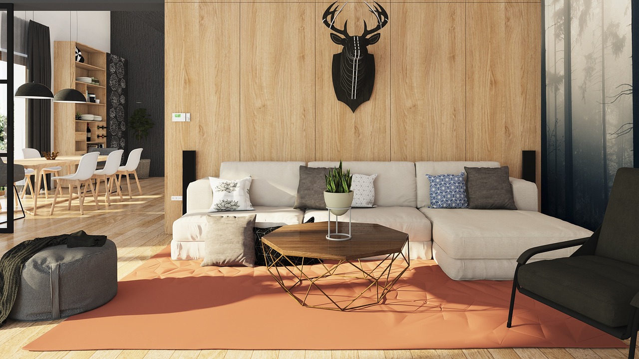
Choose a layout that matches the sofa and room
Different couch styles call for different wall treatments. A low, long sofa can carry wide horizontal art or a linear shelf. A compact loveseat may look better with one vertical piece or a tight pair of frames. A sectional often needs a wider visual field because the seating already spreads across the room. The best layout relates to the furniture footprint, not just the empty wall.
One large artwork
A single oversized artwork is the cleanest solution for many rooms. It gives the wall a focal point without adding too many small shapes. This works especially well over modern sofas, deep sectionals, or in rooms that already have accessories on side tables, bookshelves, or media units. Choose a piece wide enough to feel connected to the couch, but not so wide that it runs to the sofa arms. If the sofa is 84 inches wide, artwork around 48 to 60 inches wide will usually feel more intentional than a small centered print floating on a large wall.
A pair or triptych
Two or three related pieces can create the same sense of scale as one large artwork while adding more rhythm. This is useful when the wall needs structure without too much visual weight. Keep the spacing between frames consistent and treat the set as one larger composition. The outer edges should feel aligned with the couch rather than scattered across the entire wall. A pair works well above a loveseat or apartment sofa; a triptych can suit a longer couch or sectional.
A gallery wall
A gallery wall remains a practical choice for family photography, vintage prints, drawings, mixed media, or a more personal look. The key is restraint. A gallery wall behind a couch should read as one composition, not as storage for every frame in the home. Use a common thread such as frame finish, mat color, subject matter, or palette. For a collected look, vary the sizes but keep the spacing disciplined. For a calmer result, use matching frames and a grid.
A picture ledge or floating shelf
A ledge gives flexibility because art can be changed without repeatedly putting new holes in the wall. It is useful for renters and for homeowners who like seasonal updates. A shelf above a couch, however, needs careful planning. Avoid placing heavy objects where they could fall into the seating area. Keep the shelf shallow, mount it securely, and style it with lightweight frames, small objects, or a few books instead of crowded layers. If children use the room, safety should come before styling.
A mirror, textile, or wall sculpture
A mirror can expand light and make a narrow living room feel more open, but it should reflect something worth seeing, such as a window, plant, artwork, or architectural feature. A woven textile, quilt, rug, or macrame piece can soften acoustics and add warmth, especially in rooms with hard floors. Sculptural wall decor works best when the rest of the room is simple enough to let texture stand out.
Get height, spacing, and proportion right
The most common mistake is hanging decor too high. Wall decor should relate to the sofa, not float near the ceiling. In many rooms, the bottom of the artwork or frame grouping will sit about 6 to 10 inches above the sofa back. That gap is close enough to connect the composition to the furniture, but high enough to avoid a cramped look. If the sofa has loose back cushions that move, measure from the highest normal cushion position.
Eye level is another useful reference. Many galleries and designers use a centerline around 57 to 60 inches from the floor for artwork in open wall areas. Behind a couch, that guideline may need adjustment because the furniture changes the visual center. A tall sofa back, high ceilings, or a large piece of art can shift the ideal height. Use the eye-level guideline as a starting point, then step back and check the composition from the room entrance and from the seating area.
| Decor choice | Works well when | Planning note |
|---|---|---|
| Single large artwork | The room needs a calm focal point | Keep the piece visually tied to the sofa width |
| Gallery wall | You want a collected or personal look | Plan the outer boundary before hanging individual frames |
| Pair or triptych | The sofa is long and the room needs rhythm | Use consistent spacing and related imagery |
| Floating shelf | You want flexible styling | Mount securely and avoid heavy loose objects above seats |
| Mirror | The room needs more light or depth | Check what the mirror reflects from normal viewing angles |
| Textile or tapestry | The room feels hard, echoing, or cold | Use scale and texture to add softness without clutter |
Add depth with color, texture, and lighting
Flat wall decor can look attractive in photos but feel unfinished in a real room if the wall has no depth. Depth can come from layered frames, a picture light, sconces, a textured textile, subtle paneling, or color contrast. The right choice depends on the room architecture. A historic home may suit molding, framed art, and warm picture lights. A modern apartment may work better with one strong canvas, a sculptural sconce, or a muted limewash-style paint effect.
Color is the fastest way to make the sofa wall feel intentional. If the couch is neutral, art can introduce the main accent color for pillows, rugs, or ceramics. If the couch is already bold, the wall decor can be quieter and more tonal. Avoid matching every color exactly. A room usually feels more natural when the wall art repeats one or two tones from the seating area while adding a few related shades.
Lighting should be considered before the wall is fully styled. Plug-in picture lights and plug-in sconces can work when hardwiring is not an option, but visible cords need to be managed cleanly. Battery lights may be useful for ambiance, though brightness and battery life vary by product. If using sconces, confirm that people will not hit them when sitting down or leaning back. In narrow rooms, slim fixtures are safer than deep projection lamps.
Architectural treatments can also solve the blank-wall problem. Vertical wood slats, applied molding, shallow paneling, wallpaper, and painted color blocking create a backdrop even before art is added. These treatments are most successful when they relate to the full room, not just the couch wall. If the wall behind the sofa becomes the only highly decorated surface, balance it with simpler textures elsewhere, such as curtains, a rug, or a wood coffee table.
Adapt the idea to the room you actually have
A small living room needs a different strategy from an open-plan family room. In a compact apartment, one large piece of art can make the room feel calmer than several small pieces. A mirror may help if it reflects daylight, but it can also double the sense of visual clutter if it reflects a busy kitchen or television. In a rental, adhesive hooks may be suitable for lightweight frames, but shelves, heavy mirrors, and large art usually require more secure hardware and permission where required.
For a sectional, the wall decor does not always need to be centered on the longest cushion line. Center it on the main seating view or the largest uninterrupted wall area. If the sectional turns a corner, consider one larger piece on the main wall and a smaller related piece on the return wall rather than forcing one oversized composition across both planes. See also: Building Styles.
For rooms with low ceilings, keep the arrangement wider than it is tall. Horizontal art, a long ledge, or a row of frames can visually stretch the room. For rooms with high ceilings, a taller composition can prevent the sofa from looking lost. This does not mean filling the wall to the crown molding. It means allowing the composition to rise enough that the upper wall feels considered.
For households with children, pets, or frequent guests, safety matters as much as appearance. Heavy mirrors, shelves, cabinets, and tall decorative units should be installed with appropriate anchors for the wall type. Consumer product safety guidance commonly emphasizes anchoring furniture and using proper hardware to reduce tip-over and falling-object risks. When in doubt, use lighter wall decor above seating or hire a qualified installer for heavy items.
Common mistakes to avoid
The first mistake is choosing decor that is too small. A tiny frame above a full-size couch usually makes the wall feel larger and emptier. If you already own a small artwork you love, give it more presence with a larger mat and frame, pair it with related pieces, or place it on a ledge as part of a broader arrangement.
The second mistake is ignoring the room’s sight lines. The couch wall is often visible from the entry, dining area, or kitchen. Before finalizing the layout, view the wall from the places where people actually enter and move through the home. A composition that looks centered from directly in front of the sofa may feel off from the main doorway.
The third mistake is overdecorating. Gallery walls, shelves, plants, sconces, and mirrors can all be useful, but not all at once. If the couch has patterned pillows, a textured throw, side tables, table lamps, and a strong rug, the wall can be simpler. If the seating area is minimal, the wall can carry more character.
The fourth mistake is treating trends as rules. Large-scale art, layered gallery walls, natural textures, warm neutrals, and statement lighting all appear regularly in current interior coverage, but a trend only works if it fits the room. A good sofa wall should connect with the architecture, the couch, and the way the space is used every day.
A practical planning checklist
- Measure the sofa width, wall width, ceiling height, and space above the sofa back.
- Decide whether the room needs one focal point, a collected composition, more light, or more texture.
- Choose a layout before buying frames, shelves, or mirrors.
- Keep the main arrangement visually connected to the sofa instead of centered only on the wall.
- Test the layout with paper templates or painter’s tape before making holes.
- Use proper hardware for the wall type, especially for shelves, mirrors, and heavy frames.
- Check the view from the room entrance, adjacent seating, and normal standing height.
- Leave enough negative space so the wall looks designed rather than crowded.
If you are unsure which direction to take, start with the simplest solution to the biggest problem. A bare wall usually needs scale. A cold room usually needs texture. A dark room may need reflection or lighting. A visually busy room may need one calm piece of art rather than another layer of objects. That diagnosis is more useful than copying a layout from a room with different dimensions.
Frequently asked questions
How big should decor be above a couch?
As a general starting point, the main decor arrangement should be about half to two-thirds of the sofa width. This can be one large artwork, a pair, a triptych, or the outer boundary of a gallery wall. The exact size depends on ceiling height, sofa depth, side tables, lamps, and nearby architectural features.
How high should art hang behind a couch?
Many rooms work well with the bottom of the artwork or frame grouping about 6 to 10 inches above the sofa back. If the piece is very tall, or the sofa has a high back, adjust so the composition feels connected to the seating area and comfortable at eye level.
Is a mirror a good idea behind a couch?
A mirror can be a strong choice if it reflects daylight, greenery, architecture, or another attractive view. It is less successful when it reflects clutter, a television, or harsh lighting. For heavy mirrors, secure installation is essential because the piece sits above a seating area.
What can I use instead of framed art?
Good alternatives include a woven textile, wall sculpture, shallow ledge, wallpaper, applied molding, acoustic panels, sconces, or a mixed composition of lightweight objects. The best option depends on whether the room needs color, texture, light, flexibility, or a stronger architectural backdrop.
Should the couch be centered under the wall decor?
Usually, the wall decor should relate to the couch, but perfect centering is not always necessary. In rooms with sectionals, off-center windows, or open-plan layouts, the composition may look better when aligned with the main seating area or the strongest sight line rather than the exact wall center.