

Can Earthy Tones Interior Design Define Modern Luxury in Whitney Cummings’ Home
Earthy Tones Rule in Whitney Cummings’ Jake Arnold-Designed Living Room
Earthy tones have become the quiet force reshaping luxury interiors. In Whitney Cummings’ home, designed by Jake Arnold, this palette of muted browns, taupes, and terracottas defines a new kind of sophistication—one rooted in calmness and material honesty. The design moves beyond visual appeal; it creates emotional warmth and sensory depth. This shift from glossy minimalism to organic modernism reflects a broader industry trend where natural textures and sustainable materials express understated luxury.
The Emergence of Earthy Tones in Contemporary Interior Design
The rise of earthy tones in interior design marks a cultural return to authenticity. Designers are moving away from sterile whites and grays toward palettes that ground spaces emotionally and visually.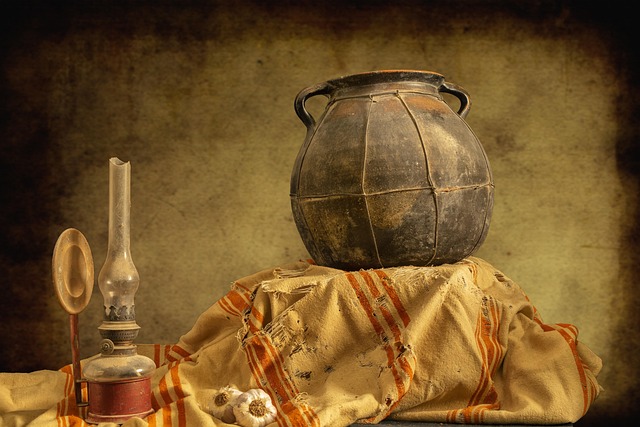
The Aesthetic Value of Earthy Palettes
Earthy tones evoke warmth, grounding, and a connection to nature. Muted browns, ochres, and terracottas bring subtle richness without overwhelming the senses. These colors work harmoniously with organic materials such as linen or raw timber, creating spaces that feel lived-in yet refined. The trend also signals a move from stark minimalism toward organic modernism—an aesthetic that values imperfection and texture over symmetry.
How Earthy Tones Align with Modern Luxury Concepts
Modern luxury is no longer about excess; it’s about tactility and balance. In high-end interiors, natural color harmony defines sophistication more effectively than ornamentation. Understated elegance replaces opulence through the interplay of tone, texture, and light. The result is an environment where every surface feels considered—plaster walls catching daylight softly or brushed metals offering quiet contrast.
Jake Arnold’s Approach to Earthy Tonality in Whitney Cummings’ Home
Jake Arnold’s design philosophy for Whitney Cummings’ residence exemplifies how earthy tones can articulate both comfort and refinement. His approach integrates material layering with spatial coherence, producing rooms that radiate serenity.
Material Selection and Its Role in Visual Warmth
Arnold’s material palette leans on natural wood finishes, stone surfaces, and textured fabrics that add tactile depth. Each element contributes to visual warmth while maintaining cohesion across spaces. Layering materials such as linen upholstery beside travertine tables creates continuity without monotony. A touch of polished plaster or aged brass introduces gentle sheen—a refined counterpoint to matte textures.
Spatial Composition and Emotional Resonance
Spatial flow plays a central role in conveying emotional balance. Open layouts allow earthy hues to transition seamlessly between rooms, softening architectural edges. This continuity fosters intimacy even within expansive volumes. Lighting complements the palette by accentuating tonal shifts throughout the day—warm light at dusk deepens terracotta walls into amber hues, enhancing the home’s tranquil rhythm.
The Psychological Dimension of Earthy Interiors
Color psychology explains why earthy interiors feel inherently comforting. These hues trigger associations with soil, clay, and wood—materials tied to stability and safety.
How Color Psychology Shapes Perception of Space
Warm neutrals like beige or caramel foster calmness by reducing visual tension. They make large spaces feel more approachable while connecting indoor environments with nature outside the window. Balanced chromatic schemes encourage holistic well-being by aligning visual harmony with emotional ease.
Sensory Experience Beyond Visual Appeal
An earthy-toned space engages more than sight—it invites touch and sound into the design narrative. Textural diversity encourages tactile interaction: rough linen curtains beside smooth marble counters create sensory contrast. Acoustic softness emerges through layered textiles like wool rugs or velvet cushions that absorb sound gently. Even scent plays a role; subtle notes from wood or leather reinforce sensory cohesion.
Earthy Tones as a Symbol of Sustainable Luxury
Sustainability has become inseparable from modern luxury design. Earthy tones naturally align with this ethos because they pair best with authentic materials sourced responsibly.
The Connection Between Natural Materials and Ethical Design Practices
Designers favor materials like reclaimed oak or limewash plaster not only for aesthetics but also for their ethical footprint. Handcrafted elements celebrate craftsmanship over mass production, emphasizing individuality in each piece. Organic finishes reduce environmental impact while preserving surface authenticity—a principle consistent with responsible sourcing standards endorsed by global sustainability frameworks such as ISO 14001 for environmental management systems.
Longevity and Timelessness in Material Choices
Neutral earthy palettes age gracefully without losing relevance. Unlike trend-driven colors that fade quickly from fashion cycles, these tones mature beautifully over time as patinas develop on wood or stone surfaces. Durable materials ensure long-term value—a practical consideration for clients investing in bespoke interiors that must endure evolving tastes.
Translating Whitney Cummings’ Design Language into Broader Trends
Whitney Cummings’ collaboration with Jake Arnold has resonated far beyond her home’s walls. It has influenced how designers interpret earthy modernism across celebrity residences and luxury markets worldwide.
Influence on Celebrity Homes and High-End Residential Projects
Celebrity-endorsed interiors often accelerate aesthetic adoption across industries. When public figures embrace grounded palettes over glossy finishes, audiences follow suit. Designers reinterpret these schemes for diverse architectural contexts—from Malibu coastal homes to Manhattan penthouses—demonstrating versatility within earthy modernism’s framework.
Future Directions for Earthy Tone Applications in Modern Design
The future of earthy tones lies at the intersection of biophilic design and technology-driven innovation. Integrating living greenery with clay-based paints enhances experiential quality while maintaining ecological integrity. Advances in eco-friendly pigments expand creative possibilities without compromising sustainability goals outlined by organizations like IEA promoting energy-efficient material production globally. As digital fabrication evolves, designers will continue merging nature-inspired aesthetics with precision craftsmanship to redefine what modern interior identity means.
FAQ
Q1: Why are earthy tones gaining popularity in interior design?
A: They offer emotional grounding, align with sustainable values, and provide timeless appeal compared to fleeting color trends.
Q2: How do designers maintain elegance using muted colors?
A: Through texture layering—combining matte surfaces with subtle sheen—to create depth without relying on bright contrasts.
Q3: What makes Jake Arnold’s approach distinctive?
A: His mastery lies in balancing restraint with warmth; each material feels deliberate yet effortless within the overall composition.
Q4: Are earthy tones suitable for small urban apartments?
A: Yes, when paired with ample lighting and reflective surfaces like plaster or brass accents, they expand perceived space while retaining coziness.
Q5: How do earthy interiors support sustainability goals?
A: By prioritizing natural materials, local craftsmanship, and finishes that minimize chemical use—all contributing to lower environmental impact over time.