Are Exterior House Styles Shifting Away From White Toward Warmer Neutrals in 2026
Are White Homes Going Out of Style? We Asked Experts About the Best Exterior House Colors to Stay On-Trend in 2026
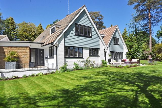
White façades have long symbolized purity and timelessness in residential design, but the tide is shifting. Experts forecast that by 2026, warmer neutrals—taupe, clay, and greige—will dominate exterior house styles. This movement isn’t a rejection of simplicity but an evolution toward depth and comfort. Homeowners increasingly seek exteriors that blend with natural surroundings rather than stand apart. The best exterior house colors for 2026 will balance sustainability, emotional warmth, and regional sensitivity, signaling a broader cultural turn from stark minimalism to grounded sophistication.
Shifting Trends in Exterior House Styles
The conversation around exterior house styles has evolved from uniformity to individuality. While white once defined modern elegance, today’s homeowners are exploring color as a medium for personal expression and environmental harmony.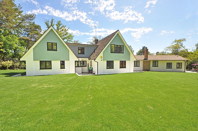
The Evolution of Exterior Color Preferences
Historically, white façades dominated residential architecture due to their association with cleanliness and order. In early American and European design traditions, whitewash was both practical and symbolic—it reflected sunlight, kept interiors cool, and conveyed refinement. Over time, this aesthetic became synonymous with suburban respectability. Yet as architectural diversity expanded, designers began questioning whether uniform whiteness still represented modern living.
Culturally, white exteriors also reflected ideals of restraint and perfection. However, as lifestyles grew more casual and nature-centric, these ideals started to feel rigid. Contemporary design now favors tones that evoke comfort rather than austerity. Warm neutrals—muted earth shades like beige or clay—mirror the textures of wood and stone found in natural landscapes.
Factors Influencing the Move Away from White
Several factors are driving this transition. First is a psychological shift: homeowners desire spaces that feel lived-in rather than pristine. Warmth communicates hospitality; stark white can seem sterile or high-maintenance under harsh light conditions.
Second is environmental awareness. Lighter paints require frequent maintenance to resist mildew or UV fading, while natural pigments in warmer hues offer better longevity and lower environmental impact. Sustainable materials such as limewash or mineral-based coatings also pair naturally with earthy palettes.
Finally, regional aesthetics play a key role. In coastal regions where brightness can overwhelm under intense sunlight, soft taupes or sand-toned exteriors reduce glare while maintaining freshness. In wooded or rural settings, deeper neutrals help homes blend into their surroundings without losing visual interest.
The Rise of Warmer Neutrals in 2026 Design Forecasts
Color forecasting agencies predict that by 2026, warm neutrals will dominate both new builds and renovations. This trend aligns with broader movements toward biophilic design and emotional well-being in architecture.
Defining Warm Neutrals in Architectural Contexts
Warm neutrals encompass hues like taupe, beige, greige (a mix of gray and beige), clay, and soft terracotta. These tones carry red or yellow undertones that create visual warmth even under cool daylight conditions. Unlike pure whites or grays that shift dramatically with changing light angles, warm neutrals maintain consistency throughout the day.
Their adaptability makes them suitable across architectural styles—from minimalist modern homes to traditional craftsman cottages. A taupe stucco wall can appear sleek beside black steel accents yet equally inviting next to cedar trim or brick detailing.
Expert Insights on the Appeal of Warm Neutrals
Designers emphasize that earthy tones resonate emotionally because they mimic natural materials people instinctively trust—soil, sand, stone. Builders note how these colors enhance texture perception: grain patterns in wood siding appear richer against beige backdrops than against crisp white.
Color consultants often mention the psychological comfort associated with these shades; they evoke stability without monotony. For residents spending more time at home post-2020s lifestyle shifts, such subtle warmth fosters calmness while preserving sophistication—a balance many architects now prioritize.
Architectural Materials Reinforcing the Shift in Palette
The growing preference for warm neutrals doesn’t exist in isolation; it’s reinforced by material innovation and renewed appreciation for tactile authenticity.
Integration of Natural Elements with Warm Tones
Natural materials—stone veneers, timber cladding, reclaimed brick—pair seamlessly with neutral palettes to form cohesive exteriors. These combinations reflect biophilic design principles that connect built environments with nature through color harmony and texture variety.
For instance, a soft clay-painted façade beside limestone detailing creates depth through contrast yet remains visually unified. Similarly, weathered oak siding complements greige stucco by introducing organic irregularity—a quality increasingly valued over manufactured perfection.
Innovations in Paint and Coating Technologies
Advancements in paint chemistry have expanded what’s possible for exterior finishes. New UV-resistant pigments preserve color integrity even under prolonged exposure to sun or salt air. Eco-friendly coatings derived from plant-based resins align with sustainable building practices while offering comparable durability to synthetic alternatives.
Manufacturers also provide customizable matte or satin finishes within neutral ranges, allowing architects finer control over reflectivity and texture interplay—a subtle but powerful tool for defining character across façades.
Regional Variations in Exterior Color Adoption
While global trends guide direction, local climates and cultures determine execution. Regional adaptation ensures aesthetic relevance without sacrificing innovation.
Climate and Environmental Considerations
Sun exposure heavily influences color selection: darker tones absorb heat while lighter neutrals reflect it efficiently. In desert climates like Arizona or southern Spain, sandy beiges perform well thermally; coastal zones favor mid-tone taupes resistant to salt-induced fading.
Humidity levels also matter—warmer hues conceal moisture staining better than pure whites do. Local vegetation further informs palette choices; homes nestled among evergreens often adopt muted grays or browns that echo surrounding foliage rather than compete against it.
Urban vs Suburban Aesthetic Preferences
Urban dwellers tend toward restrained sophistication—gray-beige hybrids paired with metal trims suit dense cityscapes where minimalism reads as luxury. Suburban homeowners often prefer inviting warmth for curb appeal enhancement: creamy taupes or terracotta accents soften massing without appearing dated.
Community standards sometimes influence freedom of choice; homeowner associations may restrict bold experimentation but increasingly approve nuanced neutral variations reflecting market demand for updated yet cohesive appearances.
Predicting Future Directions for Exterior House Styles Beyond 2026
The trajectory suggests not abrupt reinvention but thoughtful evolution—blending heritage cues with contemporary sensibilities rooted in sustainability and emotional resonance.
Blending Tradition with Contemporary Expression
Future designs will likely revisit classic forms—colonial symmetry or mid-century geometry—but reinterpret them through layered neutral schemes instead of stark contrasts. Textured plaster finishes combined with muted palettes allow minimalism to coexist with tactile richness.
Architects are already experimenting with tone-on-tone layering: pairing off-white trims against sandy walls creates dimension without relying on ornamentation—a subtle nod to tradition reimagined through modern restraint.
Long-Term Sustainability of Warm Neutrals as a Design Movement
Warm neutrals possess inherent durability both visually and materially. Their low-saturation nature means they age gracefully compared to saturated colors prone to fading cycles every few years. As reflective coating technologies advance—some integrating smart pigments capable of adjusting thermal absorption—they’ll merge aesthetic longevity with energy efficiency goals outlined by international building standards such as ISO 22197 on surface performance testing (ISO).
Ultimately this palette endures because it aligns human comfort with ecological responsibility—a rare intersection where beauty meets practicality within exterior house styles evolving beyond trend-driven cycles.
FAQ
Q1: Why are white homes becoming less popular?
A: White exteriors require high maintenance under changing climates and often appear too sterile compared to warmer alternatives that provide depth and comfort aligned with current lifestyle values.
Q2: Which warm neutral shades are most recommended for 2026?
A: Taupe, greige, clay, soft terracotta, and sand-beige are leading choices due to their adaptability across architectural types and compatibility with natural materials like wood or stone.
Q3: How do climate conditions affect exterior color performance?
A: Intense sunlight can cause fading on bright whites faster than on mid-tone neutrals; humidity-prone areas benefit from earthy hues that disguise staining better over time.
Q4: Are warm neutrals suitable for modern minimalist architecture?
A: Yes. When paired with clean lines and matte finishes, warm neutrals maintain simplicity while adding visual softness absent from pure monochrome schemes.
Q5: Will this trend continue beyond 2026?
A: Experts anticipate longevity since warm neutrals align with sustainable practices and emotional well-being priorities shaping long-term architectural direction globally.