
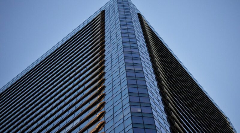
Why Is the Seagram Building Facade Still a Masterclass in Glass and Bronze?
Why Does the Seagram Building Facade Still Matter?
The seagram building facade still looks clean because it keeps to one clear idea. At 375 Park Avenue in Midtown Manhattan, the tower uses a plain grid of bronze and tinted glass to make a steady public face. If you work with building facade design, this project is more than a well-known image from an architecture book. It shows how material, proportion, upkeep, and street space can hold one design idea together over many years.
Bronze and Glass With a Real Address
The Seagram Building was designed by Ludwig Mies van der Rohe with Philip Johnson, with Kahn & Jacobs as associate architects, and built from 1956 to 1958. The NYC Landmarks Preservation Commission recorded these facts in its 1989 designation report. CTBUH’s Skyscraper Center lists the tower at about 515 feet, or 157 meters, with 38 stories. Those figures matter because the facade had to make a tall, flat slab read as one building, not just dress up a shopfront.
- Primary address: 375 Park Avenue, Manhattan.
- Main facade materials: extruded bronze, Muntz metal spandrels, and tinted glass.
- Public record source: NYC Landmarks Preservation Commission, 1989 designation report.
A Plaza That Changed the Street View
The facade does not start at the glass line. You meet it first across the granite and marble plaza, and that short distance changes the whole view. The open space on Park Avenue lets the tower be seen from base to top before the details take over. Without that pause, the same bronze grid would feel more compressed and less formal from the sidewalk.
A Landmark Record That Backs the Reputation
In 1989, the NYC Landmarks Preservation Commission described the building as a major example of International Style architecture and noted that the plaza and tower were designed as one piece. The National Park Service also includes the Seagram Building in its National Register collection. That matters when you need checked background, not just repeated comments from design books. Its reputation is backed by public preservation records, which is useful for architects, facade suppliers, and project teams doing research.
What Makes the Bronze Curtain Wall So Distinct?
Many glass towers came after Seagram, and quite a few copied the dark grid. The Seagram Building is different because the materials were chosen with care and used in a way that gives the tower weight without making it look bulky. There is also a small catch: the parts that look structural are not the true frame. Even so, they help people read the building in the way Mies wanted.
Extruded Bronze Outside the Steel Frame
The LPC report describes the curtain wall as extruded bronze with tinted glass. Mies could not leave the real steel frame exposed as he preferred, since fireproofing and building practice required it to be enclosed. His solution was to place bronze I-shaped mullions on the outside face. They do not carry the main structure, but they set a clear vertical rhythm across the facade, so the detail has a real design role rather than acting as loose decoration.
Tinted Glass That Sets the Mood
The glass is not basic clear glass. Public records and museum notes describe a warm, tinted glass that works with the bronze tone. That choice keeps the tower away from the cold blue glare often seen on later office blocks. On a grey New York day, the facade can read almost brown-black, while low sun brings out a warmer tone, so the skin changes without extra patterns or signage.
Mullions That Make Structure Visible
The Canadian Centre for Architecture catalog includes close-up records of the curtain wall showing corner columns, mullions, spandrels, and windows. This is where the Seagram Building earns much of its attention from facade people. The vertical mullions do not try to shout. They repeat bay after bay, and that steady repetition lets the elevation read as one controlled field rather than a set of separate windows.
How Did Mies Control the Facade Grid?
The Seagram facade works because the control is seen at several levels. You see it in the large rectangle of the tower, then in the bay spacing, the glass, the blinds, the spandrels, and the lighting after dark. A standard office building can look messy once daily use shows through the windows. Seagram tries to keep that office clutter from taking over the outside face.
A Fully Modular Office Tower
The LPC report calls Seagram the first fully modular modern office tower, referring to its planning grid, partition system, lighting, and facade order. That claim is tied to real layout decisions, not just a style label. The facade was not a cover fixed at the end of the job. It followed the interior planning, which is why the outside feels calm and the inside logic still matters to the elevation.
Venetian Blinds With Three Set Positions
One well-known detail is the custom Venetian blind system. The LPC report notes that the blinds had only three set positions, which helped keep the windows looking consistent from the street. It may sound strict, but anyone who checks office facades late in the day understands the reason. Blinds at random heights, crooked slats, and missing units can turn a clean curtain wall into visual clutter very quickly.
Perimeter Lighting for a Calm Night Face
The same report also notes a special lighting plan for perimeter offices, so the building could keep a steady face at night. The night effect has changed over time, and the report says the original nighttime illumination had not been used since the 1970s, though the system was still in place in 1989. The working lesson is still clear. Facade design has to consider how a building looks after office hours, not only under noon daylight.
Why Did the Plaza Make the Facade Stronger?
At street level, the Seagram Building does not follow the usual idea that a tower has to fill the lot edge to feel strong. It steps back and gives the facade room. That move feels polite on the street, but it is also a sharp design decision. The tower becomes easier to see, easier to remember, and more valuable in appearance because its full height rises from a clear open base.
A Setback That Gives the Tower Air
The plaza creates distance between the viewer and the tower. From across Park Avenue, you can read the height and proportions before the bronze details pull your eye. Without the setback, most people would see the facade in pieces from below. The building would still be refined, but it would not have the same public presence as a complete bronze-and-glass wall.
Granite and Marble as Ground Plane
The LPC report describes the plaza materials as granite and marble, placed against the modern bronze alloys and glass. That material contrast does real work at ground level. The paving feels firm and mineral, while the tower feels tight and precise above it. A loud podium is not needed because the pavement, pools, columns, and facade already speak in the same restrained language.
A Public Space Lesson for Later Zoning
The LPC report states that Seagram’s plaza influenced New York’s 1961 zoning revision, which allowed larger buildings when public plazas were provided. That policy later produced mixed results across the city, because not every plaza had Seagram’s care, budget, or proportion. Still, the basic point is easy to see. The facade became more influential because the open space made it legible to the city. See also: Building Styles.
What Can Today’s Facade Designers Learn From It?
The Seagram Building is not a panel-by-panel recipe for current projects. Bronze costs a lot, energy codes have changed, and today’s office fit-outs do not work the same way as they did in 1958. Even so, the building still gives useful rules for facade design. The lesson is not to copy the dark color, but to make the full elevation work with a clear purpose.
Material Honesty Beats Cheap Imitation
Many later towers took the dark grid idea but used cheaper aluminum and standard reflective glass. That kind of copy can look thin very soon, especially when the details and maintenance are weak. Seagram’s bronze has depth, weight, and a clear aging character. The LPC report also mentions a strict maintenance program that included annual oiling of the bronze curtain wall, which helps explain why the facade kept its presence for decades.
Proportion Carries the Whole Elevation
The tower is mainly a rectangular slab, so the proportion has no place to hide. Bay spacing, vertical mullions, spandrels, and glass tone all have to do their part. MoMA’s collection includes 1957 detail drawings for partitions, columns, and mullions at the Seagram Building. That is a useful reminder for project teams: a facade that looks simple in photos often comes from very exact drawing and site work.
Maintenance Is Part of the Design
A facade is not truly finished on opening day. Weather, cleaning, repair work, tenant changes, and replacement parts will all test the original design. Seagram’s preservation record shows why upkeep has to be planned from the start. If the bronze darkens unevenly, if the glass is replaced with the wrong tone, or if blinds become messy, the whole facade loses strength.
How Should You Read the Facade on Site?
If you visit the building, do not walk straight to the lobby and miss the approach. It is better to read the facade in steps. Start far enough away to see the whole slab, then move closer and let the joints, mullions, glass, and ground plane come into view. For this building, standing across the street is almost as useful as standing at the entrance.
Start Across Park Avenue
From the east side of Park Avenue, you can see how the tower sits behind the plaza. At that distance, the bronze grid looks almost flat, close to a measured drawing. This view explains why the building became such a strong corporate image. It looks calm, costly, and very certain in its position on the avenue.
Move Toward the Corner
At the corner, the facade becomes more physical. You can see the depth of the mullions, the darker spandrels, and the way the glass sits within the bronze order. The corner is a good place to study the assembly because the grid is clearly not a printed pattern. It has thickness, joints, and a construction logic behind the clean view.
Look at Daylight and Nightfall
The facade changes with the light. In bright sun, the bronze and glass feel warmer, while shade makes the tower look quieter and more severe. At night, even with later changes to the original lighting practice, the idea of a controlled office face is still easy to understand. For a facade designer, the lesson is simple: check the building through the day, not only in one perfect rendering.
FAQ
Q1: Why Is the Seagram Building Facade Important? A: It is important because it brings bronze, tinted glass, modular planning, and a public plaza into one clear architectural system. The NYC Landmarks Preservation Commission’s 1989 report identifies it as a key International Style work.
Q2: What Materials Are Used on the Seagram Building Facade? A: The main facade materials are extruded bronze, Muntz metal spandrels, and tinted glass. These materials are listed in the NYC Landmarks Preservation Commission designation record.
Q3: Is the Bronze on the Facade Structural? A: No, the exterior bronze mullions are not the main structural frame. They express the building’s structural rhythm while the true steel frame sits behind fireproofing and enclosure.
Q4: How Tall Is the Seagram Building? A: CTBUH’s Skyscraper Center lists the Seagram Building at about 515 feet, or 157 meters, with 38 stories. Some historical sources vary slightly, so this article uses the CTBUH figure for clarity.
Q5: What Is the Biggest Design Lesson From the Facade? A: The biggest lesson is that a strong facade needs steady material choices, clear proportion, and long-term care. Seagram looks simple because many small decisions work together.