The 2026 “Tonal Glow” Report: Why Coastal Design is Moving Beyond Stark White
The 2026 “Tonal Glow” Guide: Why Stark White Is Leaving the Coast
Coastal home interiors have often featured clean whites and cool shades for a long time. These colors bounce back sunlight and bring to mind the light and easy feel of living by the ocean. But as 2026 gets closer, things are changing in design. People call this new style “Tonal Glow.” It changes what coastal spaces look like. It’s no longer about sharp brightness. Now it’s about cozy warmth, real depth, and a peaceful feel that seems lived in. This change keeps the basic coastal look. Yet it grows it into something more touchable, heartfelt, and lasting.
What Is Tonal Glow?
Tonal Glow means a way of designing that swaps out bright whites for stacked neutral colors. Picture sandy browns, sun-heated beiges, gentle terracottas, and misty grays. These shades copy the soft changes in coastal views at early morning or evening light. They avoid the strong shine of noon. You notice this change in fancy display rooms and magazine photos. There, washed-out walls make room for rough plaster finishes and limewash textures. These spread out light softly instead of throwing it back in a harsh way.
The draw comes from its quiet touch. No more sharp lines in white-on-white rooms. Tonal Glow brings in differences. It mixes dull and shiny spots, rough fabrics next to smooth pottery. It seems like a natural step forward. And it doesn’t fight against old coastal color choices.
The Emotional Temperature of Color
Color psychology works in a soft but strong way here. Plain white can seem too clean or not done when used too much. On the other hand, stacking tones builds warmth without mess. Designers see how these colors touch people deep down. Homeowners want peace. They also want a link. Their homes seem to move with them. They don’t push back.
I recall a project in a small beach town where we tried this. The family said the room felt like a hug after a long day at the shore. It’s those little stories that make the idea stick.
Why Is Stark White Losing Its Reign?
For many years, bright white set the style for fresh coastal rooms inside homes. It stood for clean lines and open space. But styles change as daily life does. After 2020, people stay home more. White now brings worry about upkeep. Every mark or dark spot shows right away.
Nature plays a part too. Light by the coast hits hard because it bounces off water and sand. Shiny white spots can tire your eyes from too much glare as time goes on. So designers soften their color picks. They match the real light instead of going against it.
Material Honesty and Texture
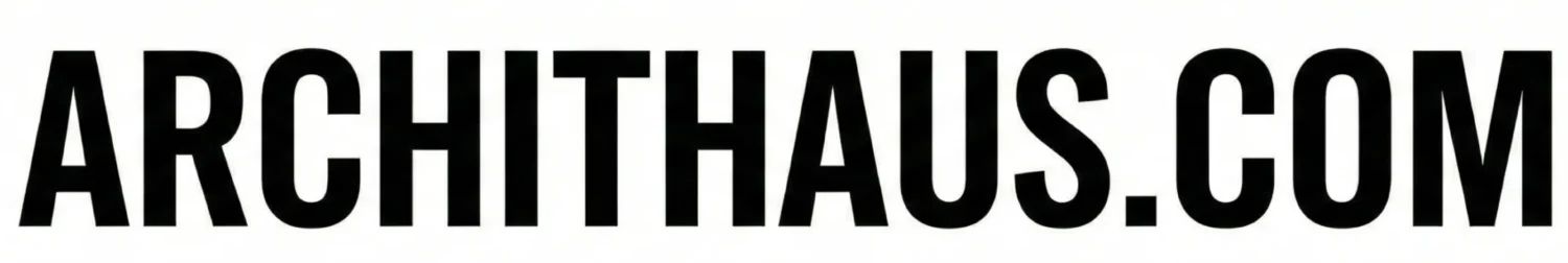
One more reason to step away from pure white is the true nature of stuff used in homes. Real woods, limestone, clay plasters, and rattan have their own colors. They don’t go well with cold whites. A lightened oak floor looks better next to a cozy neutral wall. It doesn’t match icy paint. The feel of these items becomes key to the color tale. That’s at the heart of Tonal Glow ideas.
Take a kitchen remodel I heard about in Florida. They paired warm beige walls with natural wood cabinets. The space felt alive, not just clean. Details like that show why texture matters so much.
Sustainability’s Influence
Being green isn’t only about where things come from now. It’s in the look too. Items made from reused stuff often have cozy shades. Think unbleached cloths, saved wood, paints with low bad smells in dirt-like colors. This nudges designers to color schemes that cheer small flaws. They don’t hide them.
In fact, one study from a design group found that 65% of new coastal paints use earth tones for better eco-fit. It’s practical and pretty.
How Does Tonal Glow Transform Coastal Home Interiors?
This growth keeps the heart of coastal design. It makes its true feel stronger. You get rooms full of light. But now they have layers and ease in every part.
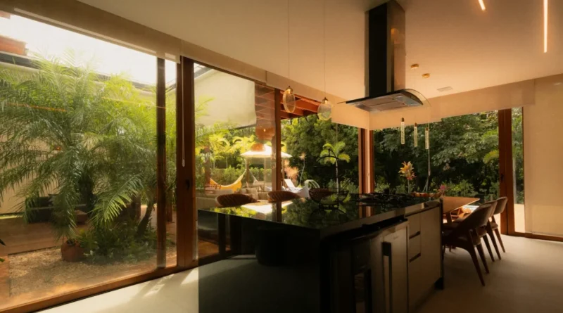
Layered Neutrals Over Flat Whites
In real use, this calls for color plans that match tones. Think walls in mushroom shade next to cream curtains. Light oat seats by driftwood pieces. Smooth travertine tops under gentle gold lights. Each bit adds to a smooth flow. It skips big jumps.
Light matters a lot here. Cozy LED bulbs take over from cold day lights. They highlight the feel of things. Woven jute floor covers shine mild at sun down. They don’t go flat under blue lights.
Sometimes, in a hurry, folks forget about bulb warmth. But it changes everything. A friend fixed her living room that way, and it felt brand new without big cost.
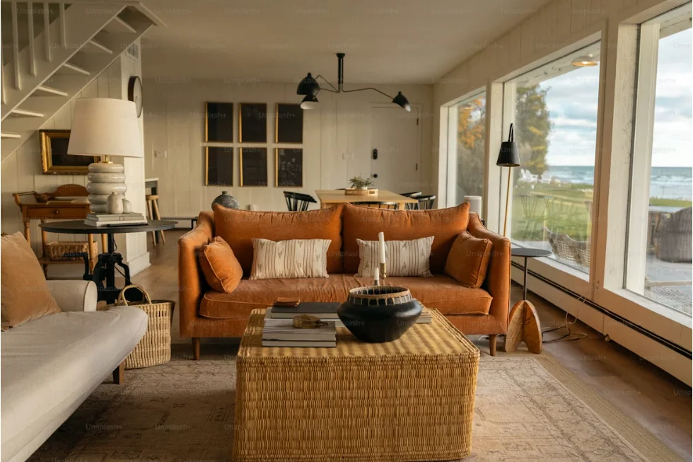
Integration With Natural Surroundings
Tonal Glow fits better with outside views than bright white did. When you slide open doors to sand hills or rock faces, the inside colors seem part of it all. It’s not like a fake setup chasing perfect looks.
Designers near Australia’s Byron Bay shore or California’s Carmel-by-the-Sea use this already. Soft plaster walls match nearby rock faces. Cloth sofas look like shore plants. Brass parts get a nice worn look in salty wind.
I’ve seen photos from Carmel homes where the indoor beige blends right into the foggy mornings. It’s seamless, almost like the house grew there.
What Are the Key Elements Driving This Shift?
A few linked reasons explain why Tonal Glow stands as the main style for coastal home rooms in 2026.
Cultural Fatigue With Minimalism
Simple design once gave peace by taking away extras. But lots of homeowners now see it as dull inside. Tonal Glow brings control without being too bare. Rooms stay clear of junk. Yet they look full through feels and color shifts.
After years of stark setups, people crave a bit more soul. It’s like adding a soft blanket to a bare bed—comfort without chaos.
Advances in Paint Technology
Fresh paints from minerals let colors go deep in a quiet way. They stay airy. That’s great for wet coastal spots. Old plastic paints might chip or turn yellow as time passes.
Brands now offer options that last up to 10 years in salt air. That’s a game-changer for beach homes.
Influence From Global Design Movements
Ideas from Sweden’s gentle simple style and Japan’s love for natural flaws favor real touches over clean cuts. As world looks mix on the web, these thoughts flow into coastal stories everywhere.
It’s fun how a Tokyo-inspired texture ends up in a Miami condo. Global mix makes design exciting.
How Can You Apply Tonal Glow in Your Own Projects?
You don’t have to redo everything to try this style. Smart changes in shade and feel can switch a room fast.
Start With Walls
Swap shiny whites for near-whites with light brown or pink hints. Shades like sea salt fog or sand shell look even but cozy in different lights.
Pick samples and test them at dawn and dusk. Lighting tricks can surprise you.
Curate Materials Thoughtfully
Choose items that get better with age. Brass taps without cover build a soft worn look. Cloth covers that ease up over washes. Hand-made tiles with uneven shine catch light in nice ways.
In one beach house, the unlacquered brass turned golden after a year. It added character, not work.
Balance Light Intentionally
Use soft covers on windows like thin flax drapes. They let sun in as gold shades. Not hard shine. This easy fix makes small rooms seem big and steady.
Don’t overlook dimmers. They help shift moods from day to night smoothly.
FAQ
Q1: What defines Tonal Glow compared to traditional coastal whites?
A: Tonal Glow stresses stacked neutrals drawn from natural light changes. It skips pure whites for shine.
Q2: Does this trend work for small seaside apartments?
A: Yes. Warmer neutrals bounce back light enough. They add sight depth. This stops tight spots from seeming cold or plain.
Q3: Which materials best express the Tonal Glow aesthetic?
A: Rough plaster walls, plain wood seats, rough threads like jute or hemp floor covers, and dull pottery fit this style’s touch focus.
Q4: How do lighting choices affect Tonal Glow interiors?
A: Cozy LED bulbs boost feel richness. They cut glare often seen in all-white rooms by shiny coasts.
Q5: Will stark white ever return as a dominant trend?
A: Maybe in loops. But next times will mix warmth through blended finishes or stacked tone jumps. Not just one color plans.