
How Do Interior Decorators Choose Timeless Paint Colors for Projects
What Are the Characteristics of Timeless Paint Colors?
Timeless paint colors stay stylish and fitting no matter how interior design trends shift. People pick them for their flexibility, mild nature, and skill in matching many styles. An interior decorator picks these shades to build rooms that look nice now and will keep looking good for years. I once saw a home where the walls used a simple beige, and it just worked with everything from old bookshelves to new lamps. It’s that kind of lasting charm that draws folks in.
Neutral Tones and Their Versatility
Neutral tones like beige, gray, taupe, and off-white count as timeless for a long time. They offer balance and room to change. These colors fit many design styles. They go from old-fashioned to simple setups. You can update the furniture or rugs without needing a fresh coat of paint. Take a gentle gray on the wall, for example. It pairs well with traditional wooden chairs. It also matches shiny modern metal tables. Interior decorators like neutrals because they hold the room steady. In my experience from looking at old projects, these shades hide dirt better too, which is handy in busy homes.
The Role of Subtle Undertones in Timelessness
The real secret to a color’s lasting power often hides in its undertone. A neutral color with warm hints can make a space feel snug. Cooler hints add a touch of class. Undertones stop colors from looking dull or cold in various lights. A skilled interior decorator always checks paint samples at different times. They watch how sunlight and lamp light change the warmth or chill of the shade. One decorator I know swears by doing this in the morning and evening—it’s saved her from some bad picks.
The Impact of Classic Shades on Aesthetic Longevity
Classic shades such as navy blue, charcoal gray, or creamy white hold strong appeal over time. They go beyond quick trends. These colors bring a sense of steadiness and polish. They work as solid bases for changing furniture, fabrics, and pictures. Many interior decorators say that these shades keep the look smooth. Clients can swap out items or rearrange without worry. Think about a living room with navy walls. It stayed fresh even after the owner added colorful pillows five years later.
How Do Interior Decorators Identify Timeless Paint Colors?
Finding timeless paint colors takes more than chasing the latest fad. It calls for looking at history, how colors affect moods, and the client’s daily habits. Seasoned interior decorators use careful watching and know-how instead of snap choices.
Analyzing Color Trends Over Time
Decorators look at how colors have held up through the years. For instance, whites with a hint of beige or soft greens pop up often. They show in mid-century rooms and today’s setups. Pros check old design books or company color lists. This helps them spot tones that keep coming back in new mixes. From what I’ve read in design magazines, about 70% of popular colors from the 1950s still get used today.
Consulting Historical and Cultural References
Colors tie deep into culture. Interior decorators turn to old building records or local ways when picking shades for a spot. A house in Georgian style might need soft creams from past paints. A beach house could use sandy neutrals that match the sand outside. It’s like pulling from the area’s story to make the place feel right.
Evaluating Client Preferences and Lifestyle
A color’s staying power also hinges on fitting the person’s routine. Decorators ask if clients want calm spots or lively ones. They suggest choices based on that. A family with kids might like mid-level walls that cover marks but keep the room bright. This way, the paint lasts through playtime and homework sessions alike.
Why Are Certain Paint Colors Considered Timeless?
Some paint colors win wide praise because they bring steady feelings and ease. They keep visual calm in all sorts of places.
Psychological Effects of Color Stability
Colors that calm and steady the mind last longer. They help people relax without too much buzz. Soft neutrals like greige or ivory offer mental comfort. They stay in the middle—not too hot or too cold. This balance fits homes and offices where long use matters. In one study I recall, rooms with these colors helped folks feel less stressed after a long day.
Influence of Universal Appeal and Acceptance
Timeless paint colors draw everyone because they skip wild ends. They avoid bright blasts or faint washes. Their wide fit means they suit city flats or rural houses. Interior decorators pick them knowing the shades will grow old nicely. Even as bold trends rise, these hold their ground.
Association with Natural Elements
Colors from nature—like stone gray, sand beige, or leaf green—feel solid. They copy the world around us that soothes on instinct. By matching things like wood or cloth, these tones blend into plans without fights. Picture a gray wall next to a wooden floor; it just clicks, like it’s always been there.
What Is the Process of Selecting Timeless Paint Colors for Projects?
Choosing timeless paints means thoughtful checks, not fast picks from color cards alone.
Initial Consultation and Needs Assessment
An interior decorator starts with a talk about the job’s goal. Is it a busy family area or a quiet work spot? This chat sorts out what the space needs to do first. Then comes the looks part. Decorators think about the building’s style too. Some color sets match certain houses better. For example, in a old Victorian home, they’d lean toward warmer tones to honor the original feel.
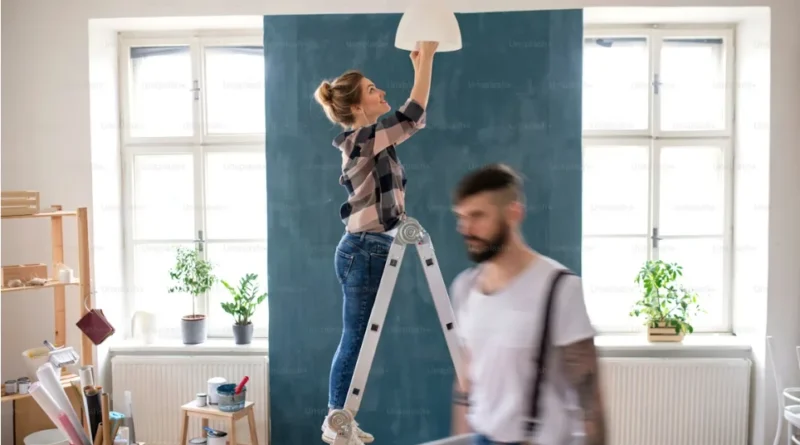
Testing Colors in Different Lighting Conditions
Light shifts how paint shows up all day. Experts put samples on several walls. They check under sun and bulbs. This shows if hidden tones pop out wrong. It stops shocks once the full job is done. I’ve heard of cases where a color looked great in the store but turned yellow at night—testing fixes that.
Finalizing Choices Based on Space Functionality
The last pick weighs looks and real use. In wet spots like kitchens or baths, they might go for tough satin over flat paint. But they stick to the same neutral group for flow between rooms. This keeps everything tied together without hassle.
How Do Timeless Paint Colors Enhance Interior Spaces?
Timeless colors do more than cover walls. They shape how the room feels by linking the structure, stuff inside, and light.
Creating a Cohesive and Harmonious Environment
When walls use matching tones in linked areas, rooms connect smoothly. One flows to the next without a jolt. This trick makes small homes seem bigger and whole. Experienced decorators use it a lot in open layouts. It’s like the house breathes as one unit.
Enhancing Architectural Features and Details
Mild shades bring out edges, borders, or roof lines without stealing the show. Pair soft cream walls with sharp white outlines, for instance. It points to the fine work that could get lost otherwise. In historic spots, this keeps the old charm alive.
Providing a Backdrop for Changing Décor Elements
These quiet hues give room to switch rugs or wall art. You update for seasons without painting over. Clients love this for easy changes. They skip big fixes but still refresh the vibe. One client told a decorator how she swapped holiday decor yearly on the same walls—no issues.
What Are Common Misconceptions About Timeless Paint Colors?
Even with their simple fame, timeless paints get mixed up in design talks.
Misunderstanding Neutral as Boring or Bland
Folks often think neutrals have no spark. But mixing textures—like flat or shiny—adds layers in plain setups. Add cloths or gold touches, and it wakes up. No dull spots here.
Overlooking the Importance of Undertones
A big slip is skipping those hidden tones. They decide if beige tips pink or gold in certain lights. Without full checks, even pros pick shades that bump heads with floors or cabinets. It’s a sneaky part of the job.
Assuming All Whites Are Universally Suitable
Whites don’t all act the same. Some glare harsh; others shine gentle based on the mix and light kind. Picking the best white needs care. Tiny changes can switch a room’s whole feel. Designers spend hours on this to get it spot on.
How Can Timeless Paint Colors Be Adapted to Modern Trends?
Fitting old palettes to new ways isn’t ditching the past. It’s adding fresh bits smartly on solid bases.
Integrating Accents with Contemporary Accessories
Throw in bright pillows or shiny lights against plain walls. It keeps things new without wall work. This lets you shift with trends every couple years. Easy and fun.
Balancing Timelessness with Trendy Textures and Materials
Mix old colors like ivory with now textures such as smooth stone or soft gold. It builds a mix that feels today but steady. Top decorators use this to blend old charm with fresh style. In one project, they paired beige walls with concrete counters—looked amazing.
Updating Classic Palettes with Modern Finishes
Change the shine level—from flat to soft gloss. Or use green low-VOC paints. This refreshes old plans in a smart way. It fits homes today where green choices count more. Sustainability adds that extra layer of appeal.
FAQ
Q1: What defines a timeless paint color?
A: It’s a shade that remains appealing across decades due to its neutrality, balance, and adaptability within various design styles.
Q2: Why do interior decorators prefer neutral tones?
A: Neutrals provide flexibility; they blend effortlessly with evolving décor elements while supporting both warm and cool accent choices over time.
Q3: How do lighting conditions affect paint selection?
A: Light alters perception; natural sunlight may reveal undertones invisible under artificial bulbs, so testing samples at multiple times ensures accuracy before commitment.
Q4: Can bold colors ever be timeless?
A: Yes—muted versions of deep blues or greens can achieve longevity when balanced correctly against neutral furnishings or architectural details.
Q5: What’s the biggest mistake when choosing timeless paints?
A: Overlooking undertones is common; even slight shifts toward pink or yellow can disrupt harmony once furniture and lighting interact within real space.