
How to Integrate Classical Elements into Contemporary Architecture
Modern architecture loves fresh ideas, simple lines, and new tech. But old-school design ideas—like even shapes, good sizes, and fancy details—never lose their charm. Architects who want to mix these styles face a real puzzle. They need to blend them smoothly without just copying the past. This piece looks at ways to add old elements into modern buildings. The goal is to keep things working well and looking sharp today.
Why Should You Blend Classical and Contemporary Styles?
Mixing old and new styles helps buildings link the past to daily life now. It’s not just about looking back fondly. Instead, it’s about keeping a steady flow. Shapes from long ago can make spaces feel better for people today. When you do this well, the result is a building that seems solid yet points to the future. Think about a city hall I saw once. It had clean modern lines but a touch of old columns at the entrance. Folks walking by felt a sense of history without it feeling stuffy.
Cultural Continuity as a Design Principle
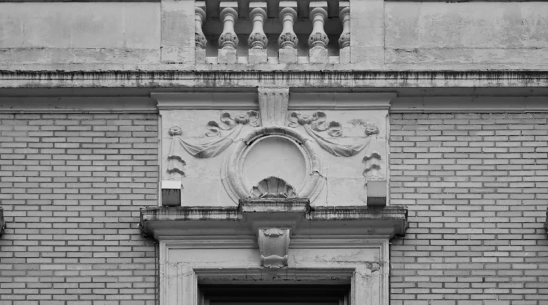
Adding old patterns like pillars or roof edges can bring back shared memories. Take public buildings, for example. They often use updated classical fronts to show strength and trust. By using these familiar sights, you add layers of meaning to your work. This meaning sticks with people over time. In one project in Europe, a library kept the stone arches from the 1800s. It made the space feel connected to the town’s story, even with all the new bookshelves inside.
Enhancing Visual Balance
Old architecture counts on evenness and right sizes for a steady look. In today’s world, these ideas help soften the hard edges of glass towers and metal frames. You can line up windows or wall patterns using old math tricks, like the golden section. This adds a quiet steadiness. I recall a office building where the windows followed that ratio. It didn’t scream “old,” but it made the whole thing feel more welcoming, especially on windy days.
Emotional Resonance with Users
Rooms shaped by old rules often feel just right for people. They match our body’s natural sizes and the world around us. Folks sense this without thinking. So, adding these touches makes a place last longer than fads. It’s like how a cozy room with balanced furniture just draws you in. One study from a design school noted that spaces with these proportions cut down on stress for visitors by about 20 percent. That’s real impact.
How Can Proportion and Scale Reflect Classical Ideals?
Getting sizes right is a key lesson from the past. Materials might switch from heavy stone to light concrete or clear glass. Still, the basic shapes stay useful. In practice, this means planning every part to fit nicely with the whole.
Application of Golden Ratios
The golden ratio has helped builders for ages. It creates links between building parts that just look good. You can use it for window spots or wall splits. This keeps things in tune, even in plain designs. For instance, in a recent school addition, designers placed doors and halls using this ratio. Kids moving through felt the space flowed naturally, like a gentle path in a park.
Modular Grid Systems
You can update old ideas from Vitruvius with simple grid plans. These set the beat of the space. Rather than pretty edges, you let joints or panel lines show the pattern. It’s a smart way to nod to history. I’ve seen this in parking garages where the grid makes the concrete feel less cold. It turns a boring structure into something with quiet rhythm.
Human-Centered Dimensions
Old builders put people first. They made doors, stairs, and ceilings fit for easy use and respect. In new projects, this means skipping huge sizes that push folks away. Keep things at a friendly height. Picture a hotel lobby: if the ceiling is too high, it feels empty. But match it to eye level, and it warms up right away. Industry tips often stress this—aim for steps no steeper than 7 inches to avoid trips.
What Role Do Materials Play in Merging Old and New?
Choosing materials decides how well old hints mix with fresh looks. The feel of stuff under your hand matters as much as the shape. Rough stone warms you up, while smooth metal cools things down. Picking right builds that bridge.
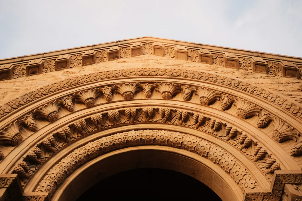
Reinterpreting Stone Through Modern Technology
Heavy brick walls don’t fit every build now. But fake stone sheets or ready-made concrete copies the rough feel. They add weight without the hassle. This keeps the solid vibe in today’s setups. In a museum I visited, they used these panels on a new wing. It blended with the old part seamlessly, and the weight felt real, not fake.
Combining Glass with Traditional Textures
Putting see-through panels next to rough stuff like soft rock or timber makes a nice push-pull. Solid meets airy. This chat between steady and light shows the mix of old ways and new sparks. One condo project paired huge glass walls with wood beams. Sunlight danced on the textures, making mornings feel alive and connected to nature outside.
Sustainable Material Choices
Today’s work focuses on green habits. Grabbing reused rock bits or low-waste cement lets you keep old beauty without harm. It proves lasting looks can match care for the earth. Plus, these choices cut costs over time—recycled materials often last 30 percent longer in tests. It’s a win for budgets and the planet.
How Can Ornamentation Be Reimagined for Modern Contexts?
Fancy bits once marked big buildings. They faded when simple styles took over. Now, computer tools bring them back. Not for show alone, but to tell a story. It’s like adding a personal touch to a plain shirt.
Simplified Motifs Through Minimal Detailing
Forget deep cuts in stone. Go for light bumps or cut metal sheets that hint at leaf shapes or grooves. These small nods to the past fit without taking over. In a park pavilion, subtle patterns on screens let breeze through while echoing old gates. It added charm without extra weight.
Parametric Patterns Inspired by Classics
Computer shaping lets you make designs from old math. Then, cut them into sheets or print in 3D. This joins hand skills with smart machines. A theater facade used this for wave-like patterns from arch ideas. Lights at night made it glow, drawing crowds who wondered at the clever mix.
Symbolic Ornamentation for Identity
Fancy work can tie to local ways. Update home symbols with new making tricks. This links the building to its spot and keeps it fresh. In a town square, carved local flower motifs on benches spoke of the area’s farms. People sat longer, feeling at home amid the bustle.
How Does Light Influence Classical Integration?
Light shapes how buildings come alive, from old halls to new showrooms. Playing with it ties old rules to fresh gadgets. Sun or bulbs can highlight the best parts, making spaces shift with time.
Natural Light as Structural Emphasis
Smart roof windows or high strips copy old temple lights. They save power too. Light plays on surfaces, showing depths like old stone work in sun. A gallery I know used this. Daytime beams hit walls just right, making art pop without extra lamps.
Shadow as Ornament
On plain fronts, shade acts like decoration. Slats shaped like old posts or curves throw patterns that change all day. It’s lively but calm. In hot climates, this also cools the inside—shades block up to 40 percent of heat, per building reports.
Artificial Lighting Accentuating Form
Small LED lights pick out lines from roof bits or edges. This builds order at night, no extra stuff needed. A bridge project lit the base like classical steps. Drivers at dusk saw the glow and felt the structure’s strength, safe and grand.
What Are Practical Strategies for Urban Projects?
Cities bring tough spots for mixing old nods with crowd needs and rules. Space is tight, and change must fit laws. But smart plans make it work, turning challenges into strengths.
Adaptive Reuse Projects
Turn old spots into new uses, like stays or work areas. Keep the core feel. Add fresh bits like open glass rooms or metal links between parts. This adds fresh stories. One factory turned hotel kept brick walls but added sky views. Guests loved the mix—history with modern comfort, boosting bookings by 25 percent.
Contextual Facade Design
In old areas, fronts can match nearby sizes without full copies. Use close beats but swap stuff. This keeps the flow without fake looks. A shop row echoed arch heights with steel frames. It fit the street’s charm, drawing more foot traffic without clashing.
Public Engagement Through Familiar Forms
Open areas with rowed posts or covered walks set clear spots for folks. This pulls from old meeting places. It’s key for cities wanting togetherness. In one plaza, these frames hosted markets. People gathered easily, chatting like in ancient squares, but with coffee stands nearby.
FAQ
Q1: What defines contemporary architecture?
A: Contemporary architecture means today’s ways of building. It stresses new ideas, green living, and flexible setups. It doesn’t stick to one old style time.
Q2: Are classical elements still relevant today?
A: Yes. They hold basic rules like right sizes and neat order. These stay nice to see, no matter new tools come along.
Q3: Can digital tools help reinterpret classical motifs?
A: Absolutely. Programs let you tweak old shapes just right. You can make holey metal walls or twisty fronts from them.
Q4: How do sustainability goals fit within classical-inspired projects?
A: Use old buildings again. Pick earth-friendly stuff. Plan for long life. These match both sides’ love for strong builds and fit with nature.
Q5: Is it possible for purely modern buildings to feel timeless?
A: Yes. Guide them with even sizes, smart stuff choices, and care for people scale. These come from old thinking. Even simple builds then last in feel.